
Dinckley Court
Overview
Project: End‑to‑end UX/UI, website design and delivery, and brand design for a boutique B&B
Role: UX/UI Designer and site build, end‑to‑end ownership
Team: Solo project, with client collaboration
Timeline: Two weeks, from research through to delivery, March 2022
Platform: Responsive web design
Skills: Opportunity identification • User research • UX strategy • Brand identity • Responsive UI design • Frontend implementation (CSS/HTML).


Client
Dinckley Court is a family-owned and run B&B in Oxfordshire. Although based in a rural setting, the main attractions are the high-quality rooms, peaceful atmosphere and convenient proximity to Oxford and other local interests.
Brief
The client wanted a website and full brand identity to add value to their business and communicate their key features to potential guests - thus building the credibility of their independent business. This project was a Bespoke Website service as part of my Ottilie Ruth business. Room booking was outside the scope of this project.
End-to-end website design process
Research
Stakeholder questionnaire
Stakeholder interview
UI design
Proto-persona
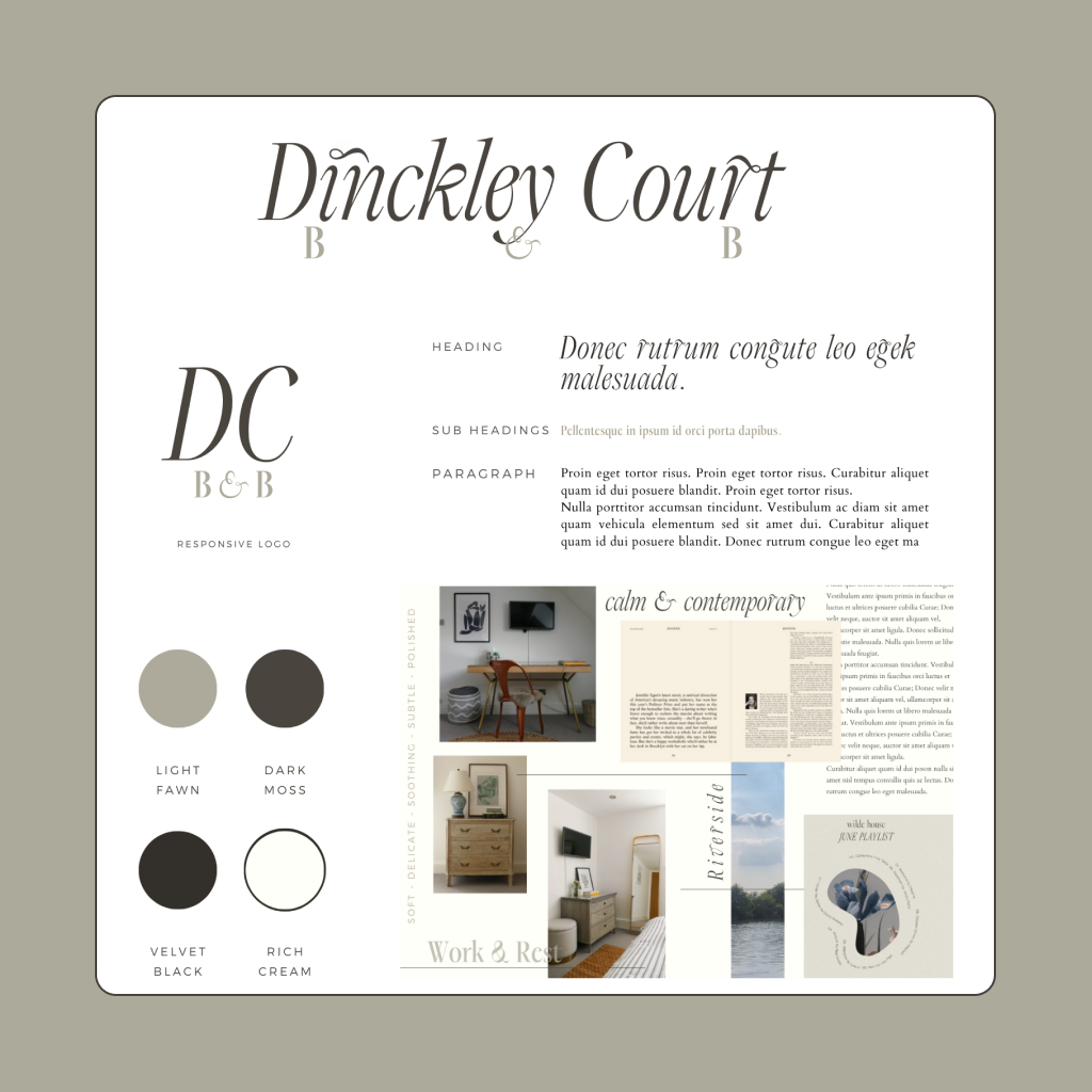
Brand identity design
Colour, typography, logo
UX design
User flow
Information architecture
Initial page desings
Feedback
Design presentation
Stakeholder feedback & design iteration
Build
Website build
HTML + CSS
Site sign-off
Visual identity
As with all my web design clients, Dinckley Court’s branding was based on deep consultation with the client to understand their business value proposition, USP, and guests. Clients complete questionnaires and then we meet for a two-hour consultation call for me to fully understand their business and make recommendations on the best brand identity.
Business values
Quality
Comfort
Thoughtful
Personable
Unobtrusive
The clientele can be split into two main proto-personas:

Business persona
Business guests travelling for work value the peaceful location and facilities to work and rest.
DC is looking to attract more business guests and the brand identity should appeal to professionals looking for high-quality, well-located and peaceful accommodation with the character that comes with a family business.
Pleasure persona
Holidaymakers looking to use DC as a base to explore local attractions. They are happy to invest in premium accommodation and enjoy the extra touches like homemade breakfasts to their door and quality interior design.
Children and pets are not allowed, the brand identity needs to communicate this.
Brand identity
Soft
Subtle
Delicate
Soothing
Polished
Website visitors will feel calmed and welcomed by the website, a one-page long scroll website. The brand identity avoids the rustic, country and cutesy feelings of local competitors and the premium feel communicates DC is upmarket accommodation and not a budget option or venue for children.
Image layouts are scattered, relaxed and informal - arranged around text columns that are reminiscent of editorial text layouts. The overall effect is soothing, polished and subtle.
Mood board

Visual identity


Style tile
The brand identity is to communicate a feeling of calm and quality whilst avoiding exclusivity and elitism. Subtle colours convey the soothing feeling of the rooms and the peaceful atmosphere of DC in general.
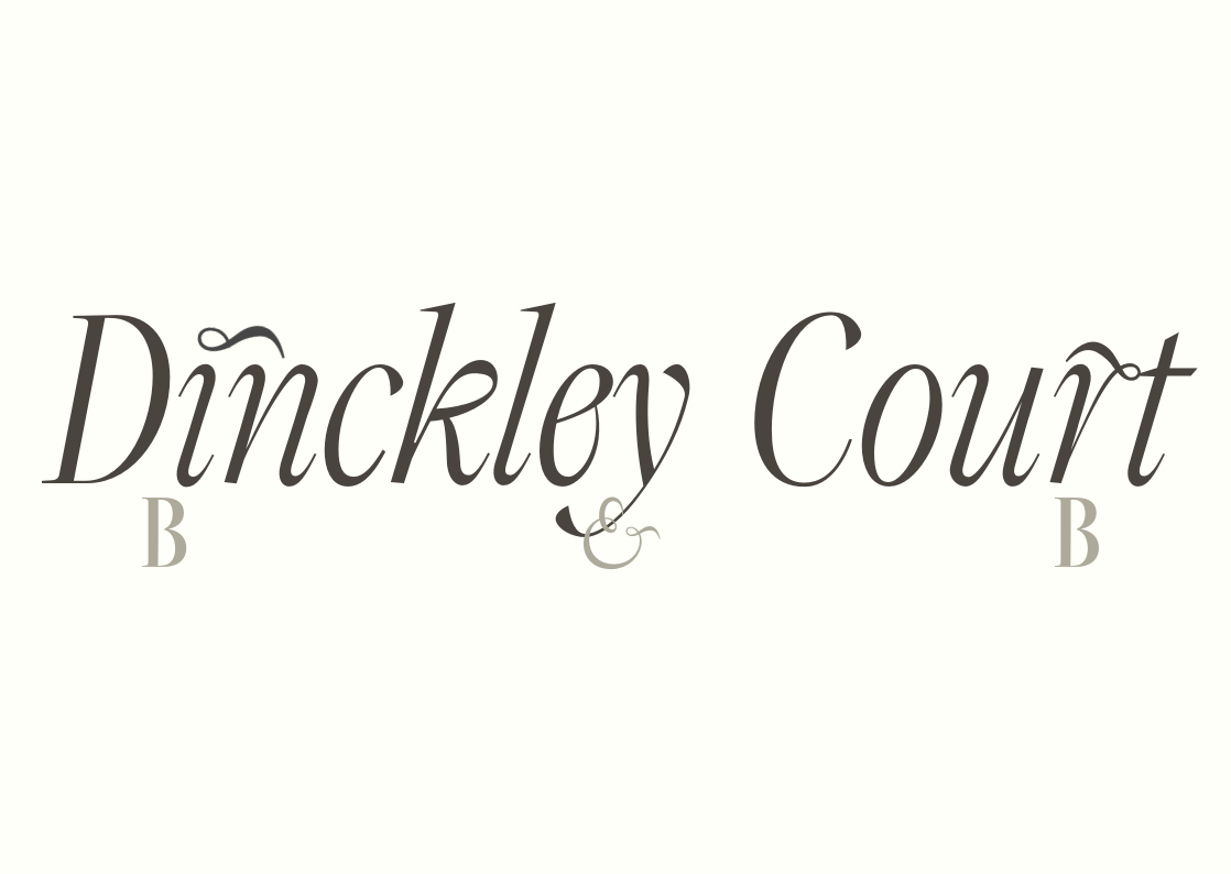
A flowing italic logo and header font forms a key, distinct and recognisable part of the brand's handwriting. The font ligatures flow like the river at the end of DC's rolling garden. The main DC logo can be developed for additional venues under the DC title in the future (e.g. 'holiday rental' & 'art studio' in place of 'B&B').
Final design


Project Overview
After consulting extensively with the client on their requirements for the site it was decided to create a one-page website for the simplest user journey. Jump links were used in a mobile-style menu to allow for quick navigation to essential information.

Finally
If you are interested in collaborating on a project or expanding your full-time UX team, get in touch.