
Senior UX Designer at Kyero.com
I'm the UX team of one at Kyero.com, where I own the end-to-end user experience of this high-traffic international property portal. I lead all key redesigns, run multi-language research programmes and collaborate across engineering and marketing to deliver purposeful data-informed design that simply answers user needs and exceeds business goals.
-
I’m responsible for the user experience across the entire website, ensuring a seamless journey for buyers, renters and estate agents to support key business goals. I collaborate closely with engineering; presenting prototypes, refining new designs and implementing iterative improvements. I also work within marketing to align all product design with our SEO strategy, integrate site analytics into designs and produce brand-consistent assets for web and email.
-
Led a full redesign of the search results page
Ditto property listings page
Launched Kyero’s user research programme, including a survey of 3,000+ users in four languages

UX Designer, 2023 - Oct 2025 // Senior UX Designer, Nov 2025 - present
Please note: This case study has been kept purposefully high-level and intentionally vague to protect live business interests. Contact me to organise a study walk-through and see early sketches, concept development thinking and key UX documentation.
Product design
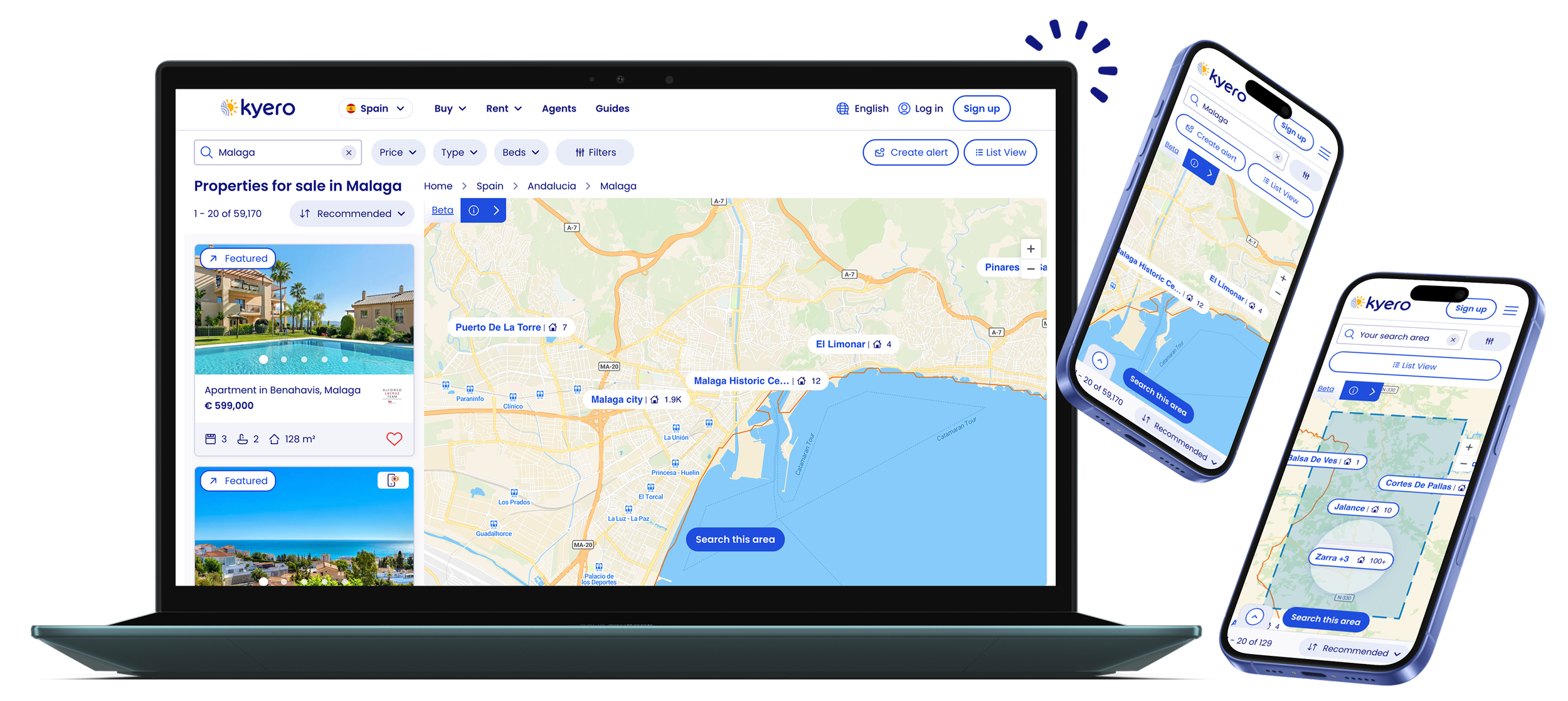
New feature: Map search
Kyero’s new map view for property search is a concept identified in my user research as our most requested feature. Once identified, I pitched to get it added to the product road map, defined stakeholder limitations and applied user insights to take the design from lo-fi through to dev-ready prototypes. This new feature has increased property engagement, with map users viewing +16% more properties than non-map users in the three weeks this has been live.
Full project write up coming soon.

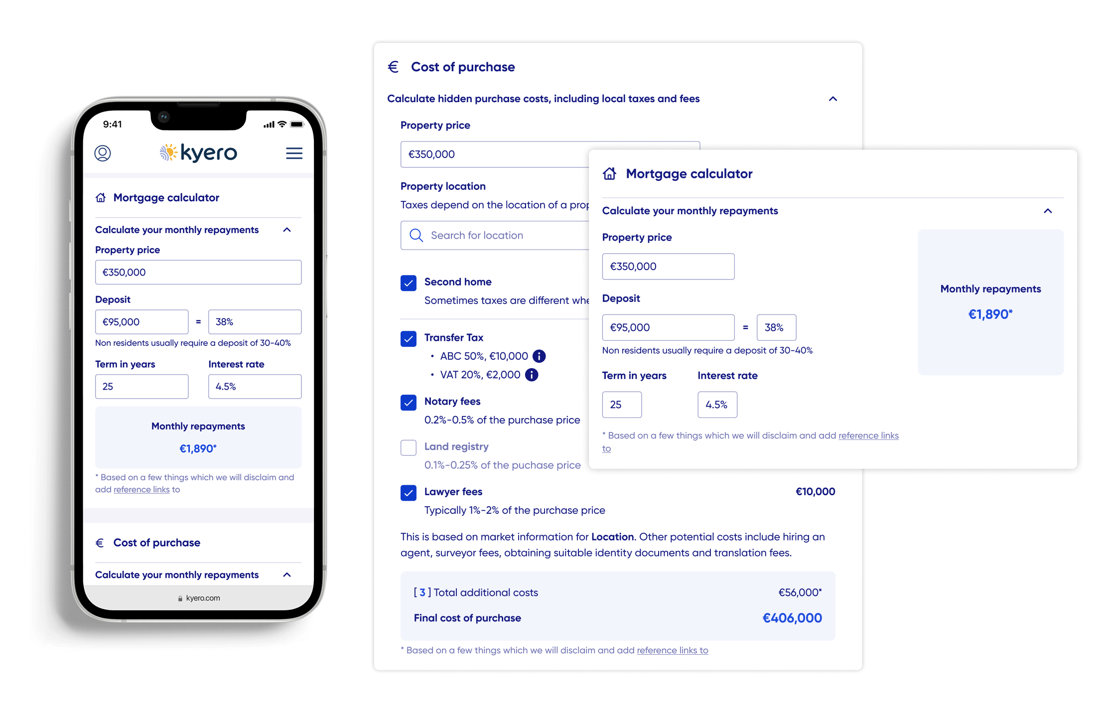
New feature: Cost calculators
To ease user worry and confusion around the final costs of property purchases, we introduced two new tools, present on every property page.
Mortgage calculator
A simple but informative mortgage calculator, showing monthly repayments for users to quickly verify if a property is affordable.Cost of purchase calculator
The answer to a common user concern: hidden costs, specific to the locality, for example, regional taxes and notary fees.

Key re-design: Search page
UI did not match refreshed branding seen elsewhere on-site and in marketing materials; the updated branding reinforced brand values that directly appease users’ worries when looking for property abroad.
Filter behaviour not in-line with industry standard, and filters within a scroll modal meant users were not making full use of the available filters
SEO strategy required an increase in onward links on the page, which also added value for users who are “just dreaming”, encouraging them to explore alternate locations
Before

Search filters: The majority of search filters have reduced visibility on desktop, with a small scroll frame obscuring them on first look.
After

Search filters: Filters housed within a slide-in modal - bringing the design up to spec with competition, improved usability (testing confirmed this) and a spacious design in-line with the Kyero brand + UI.
On-going iteration
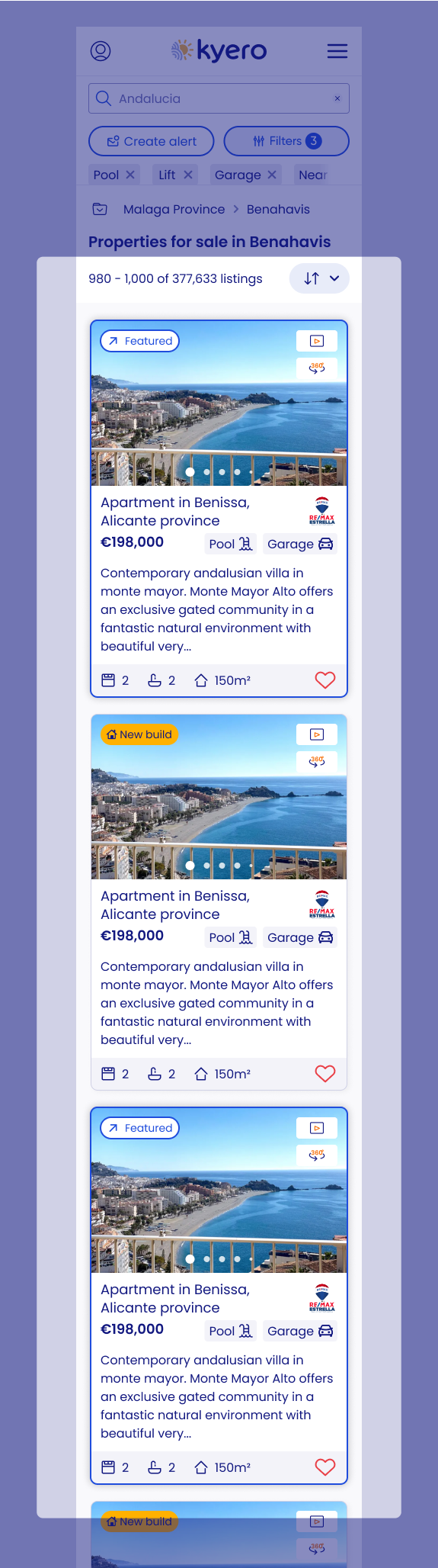
Mobile
Updated featured property designs, on mobile, they were in a carousel, an archive from previous versions’ design.
Analytics showed properties 2 and 3 had reduced clicks, which did not complement the business model or user experience.
Solution: Stack featured properties, removed “featured properties” title.
Desktop
Featured properties did have a prime position above the fold; however, they had a reduced level of overview detail compared to “normal” property listings.
Solution: Add these into the stack with a distinctive UI, including a featured tag, which meant there was no need for the “featured properties” title - reducing visual noise in the busy search bar.
The result of these iterations improved click-through onto featured properties, especially on mobile.


Key re-design: Property detail
Improved UI for clearer intake of top-line property information.
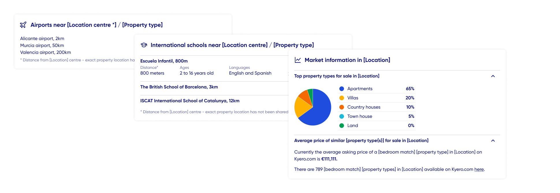
Clearer key property features, answering a key user worry of not knowing if a property will meet their needs. An especially pressing worry for users buying in a faraway location that requires a flight to do a property visit.
User interview and survey insights revealed a need for local area information. This was then embedded in the property page, to increase page value. Information added included expat population, schools and airport proximity.

Research

Annual market survey
What
Annual user survey, sent to existing Kyero mailing list subscribers.
Goal
Best understand our market for all department business decisions
Generate invaluable insights we can share with our agents, to further reinforce our market position as the leading expert on international buyers.
How
I project managed from start to finish, including liaising with marketing to create the identity of the email marketing, designing the survey in collaboration with other functions and preparing all translations (four languages).
Analysis + outcome
I translated and cleaned 4,800+ responses
Analysed the data to extract useable insights
Fresh user insights used for a buyer survey report and to update key UX documentation.


Tools
Figma
Trello
Usertesting.com
Confluence
Miro
Slack + gather
Projects are managed through Trello, with engineering working in sprints. I manage my own projects to ensure they’re ready for their allocated sprint.
This includes planning and executing user research programmes, completing design iterations, performing prototype testing, and ensuring that all variables and edge cases are detailed in high-fidelity engineering-ready Figma files.
Details
Details of this work, especially regarding research and concept development, have been held back to protect ongoing business interests. However, I’d be happy to share more details, including research planning, early concept development, reams of lo-fis and design rationale on request.
Please get in touch to organise a study walkthrough.