
Search index re-design
Overview
Project: End-to-end UX project delivering a redesign of the search index page
Role: Senior UX Designer (end-to-end ownership)
Team: PM, two front-end engineers, two back-end engineers - working remotely, two-week sprints
Timeline: 6 months from concept to delivery
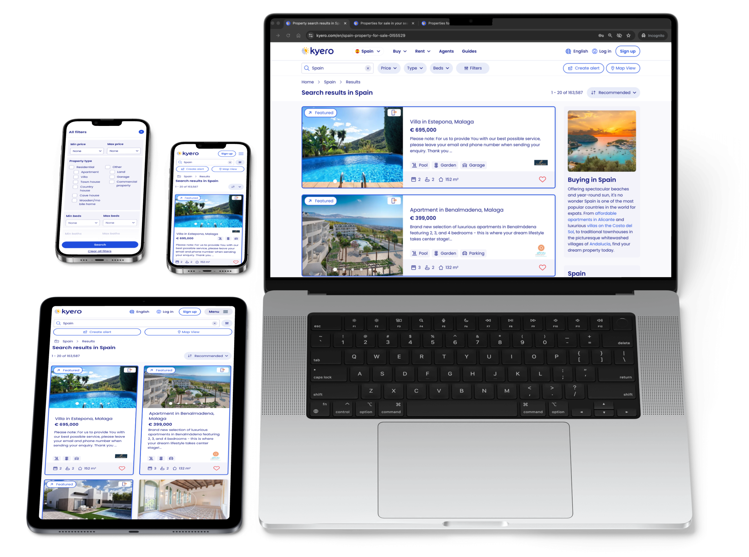
Platform: Responsive web design
Skills: UX strategy • UI design • Concept to final design • Testing and iteration
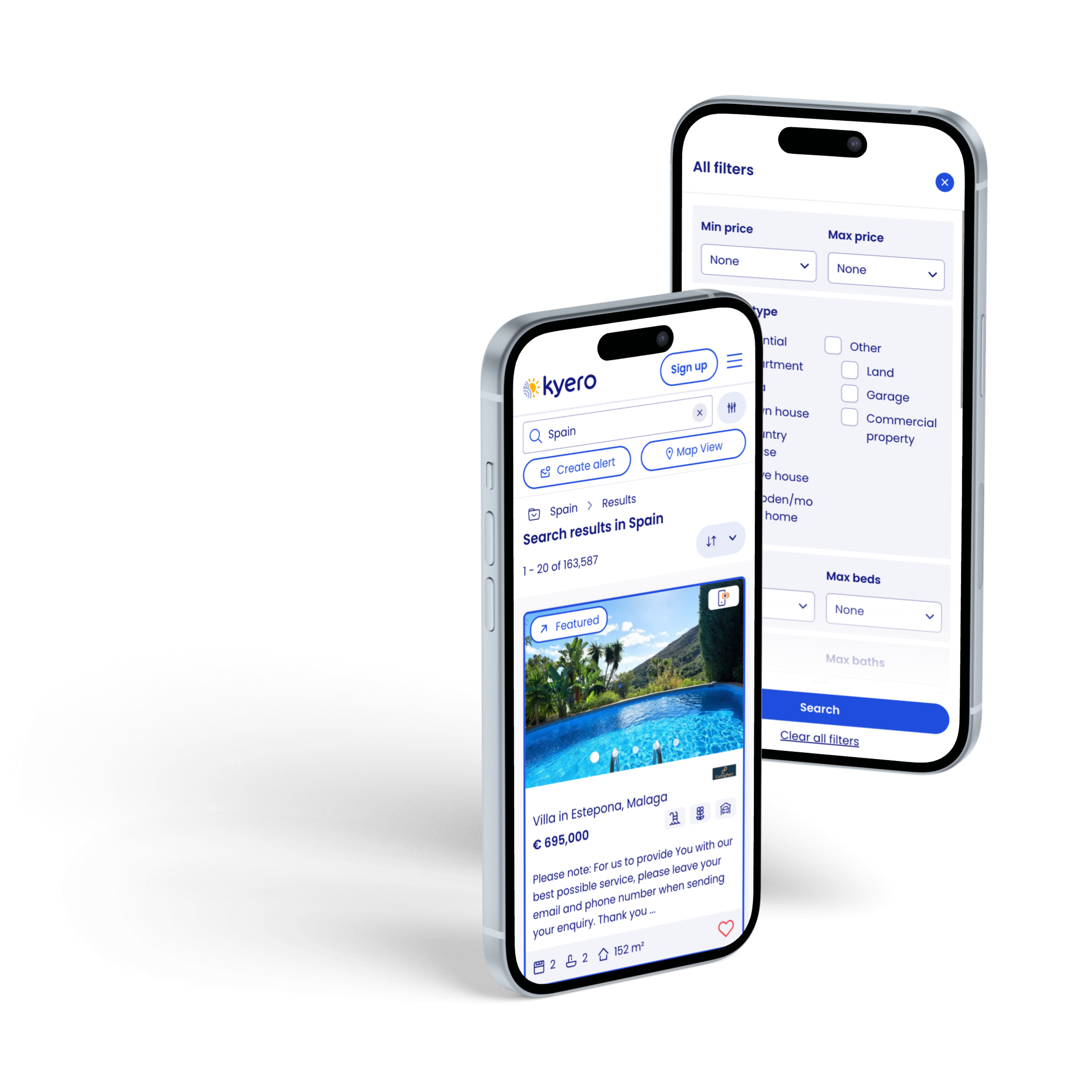

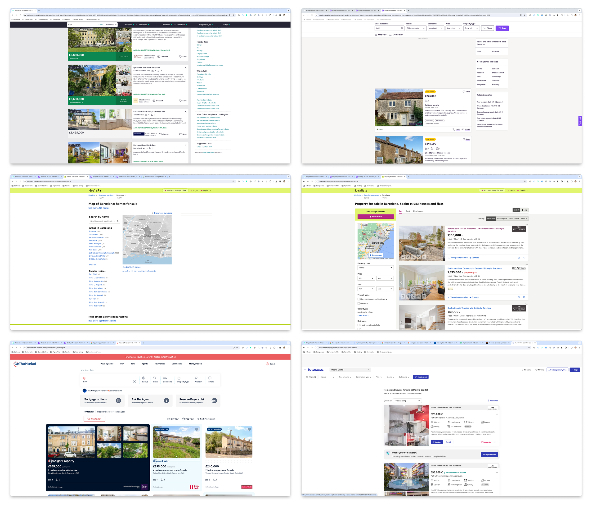
Before and after redesign
Impact summary
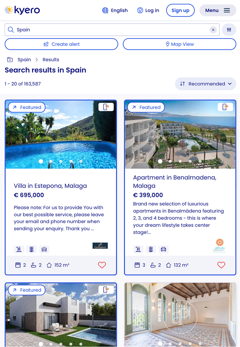
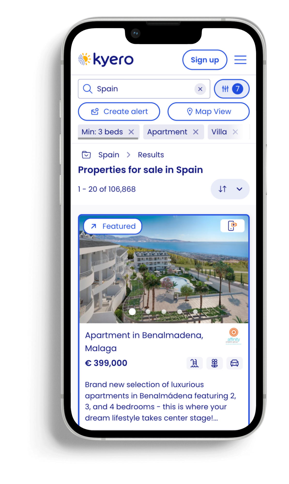
Redesigned the search index page, transforming Kyero’s main page from an outdated UI with high-friction search interactions to a clear, modern search page with easy, expected search interactions, more visibility for boosted properties and a side panel to encourage more location exploration.
A full page UI and structure redesign included new: property tiles, search bar and filter layout, interactions and animations, pagination, FAQs and more. Ownership included the research and usability testing, directing UX strategy and partnering with SEO and Engineering.
Results:
Increased filter engagement
Improved search area exploration
Higher conversions from prioritised CTAs (alerts and featured properties)
Business context
Kyero had invested in a branding redesign, including updated colours and fonts, required to bring the site UI up to current expectations and to match/exceed other competitors’ look and feel. The design update had been rolled out page by page, and I led the UX and UI redesign of the search index page - one of the highest-traffic and most commercially critical areas of the site.
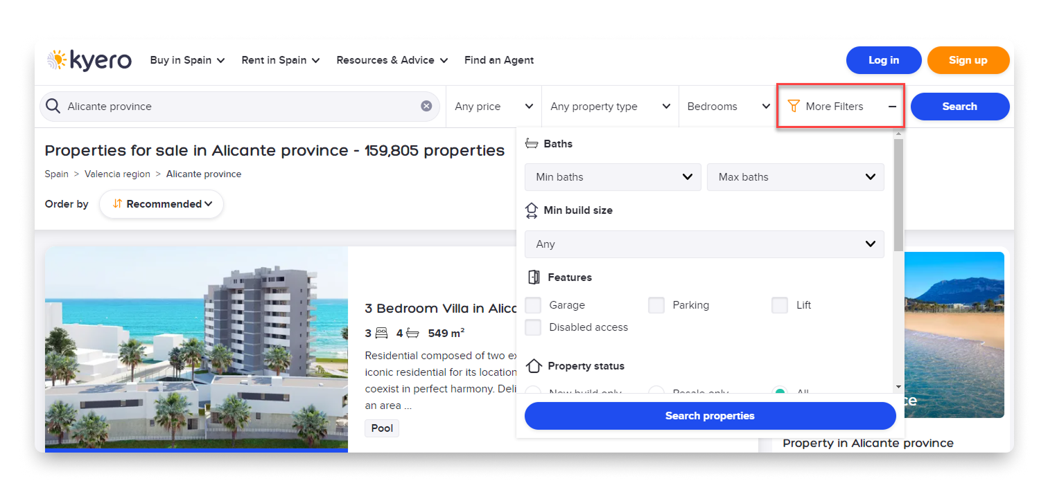
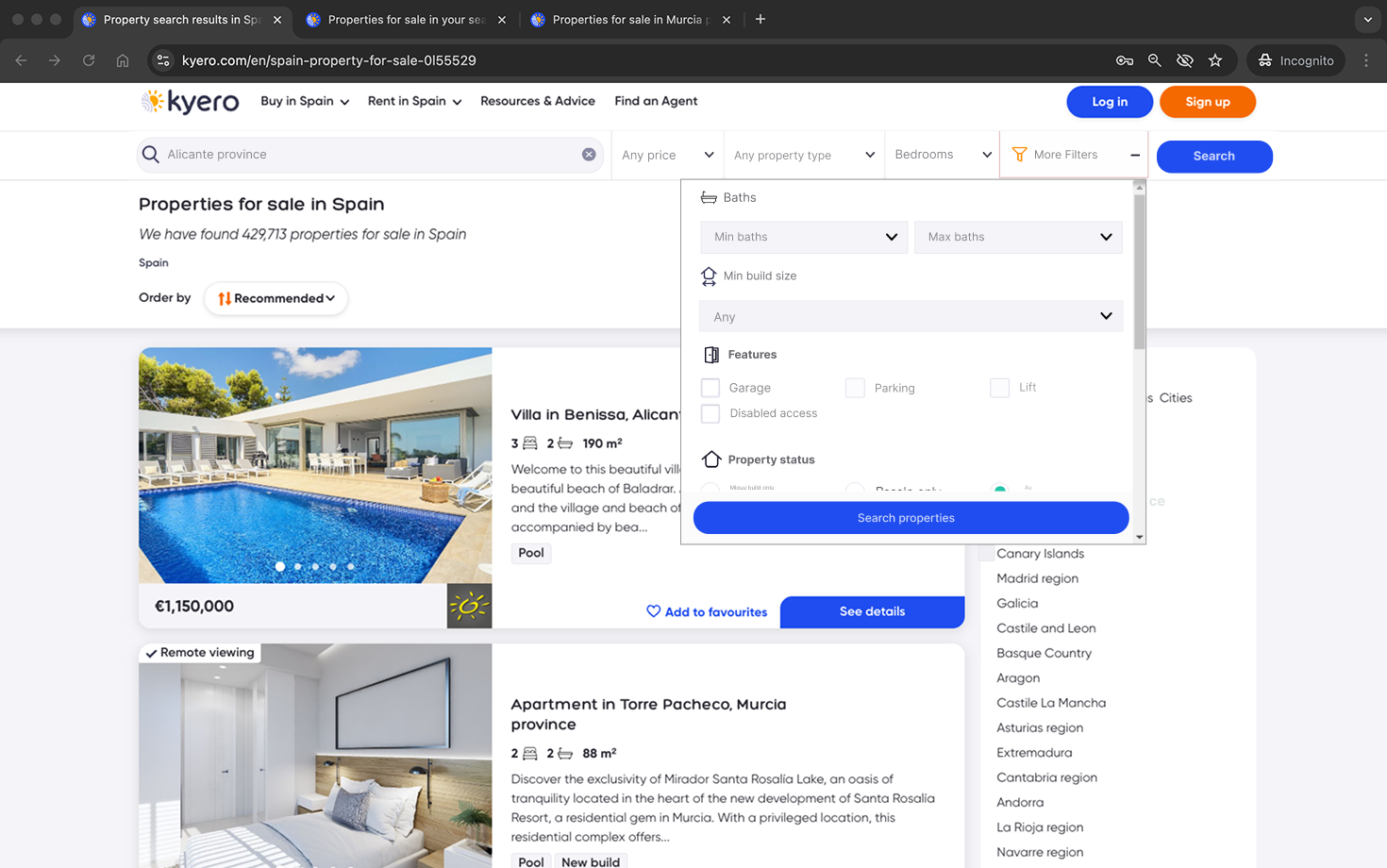
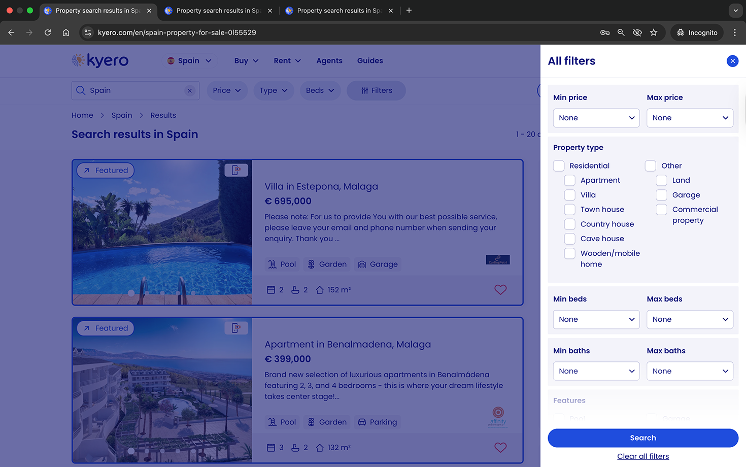
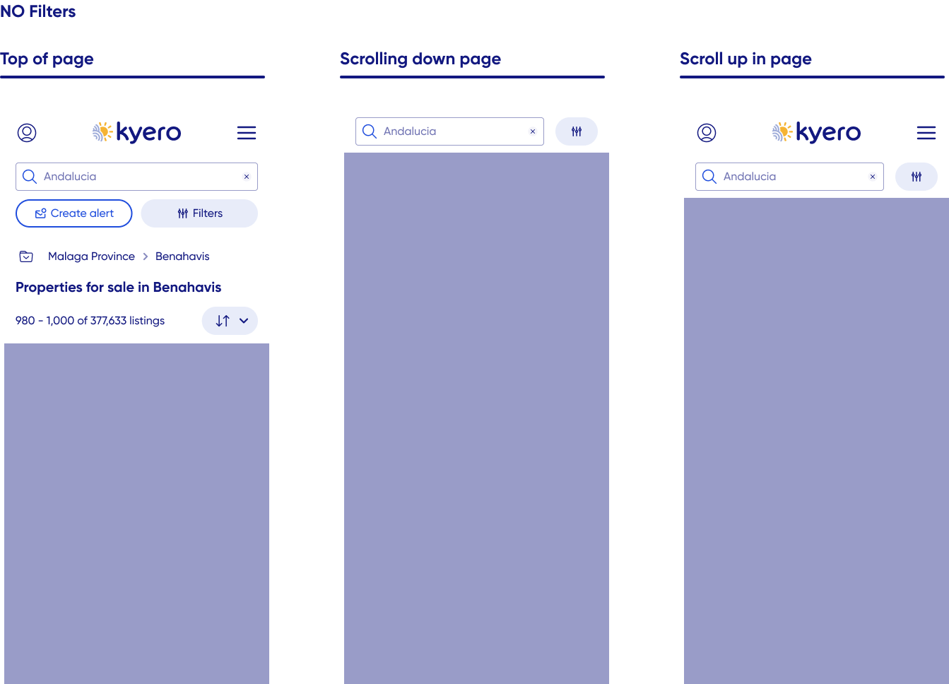
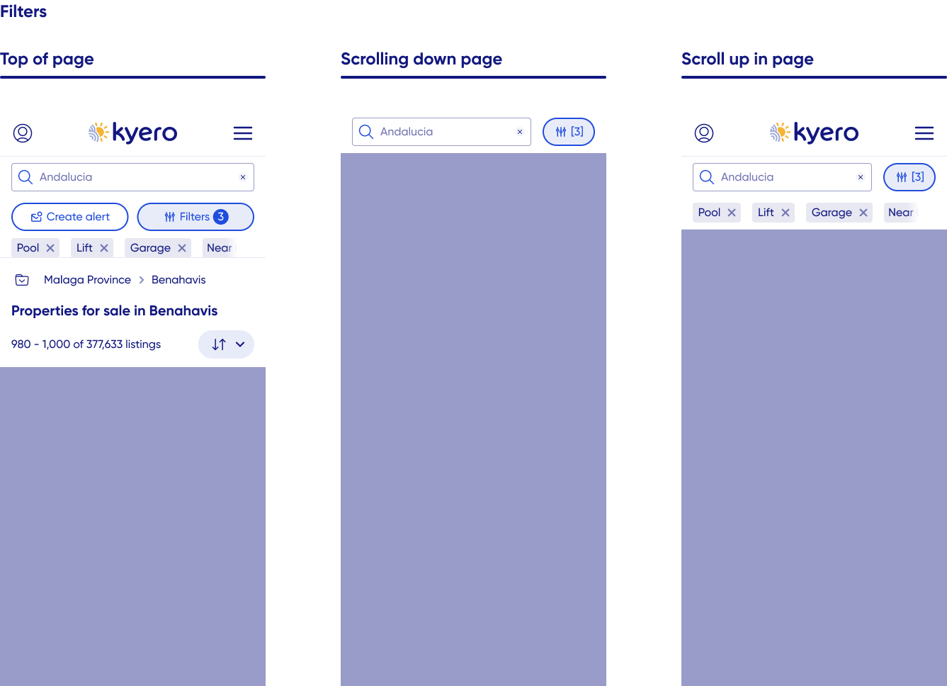
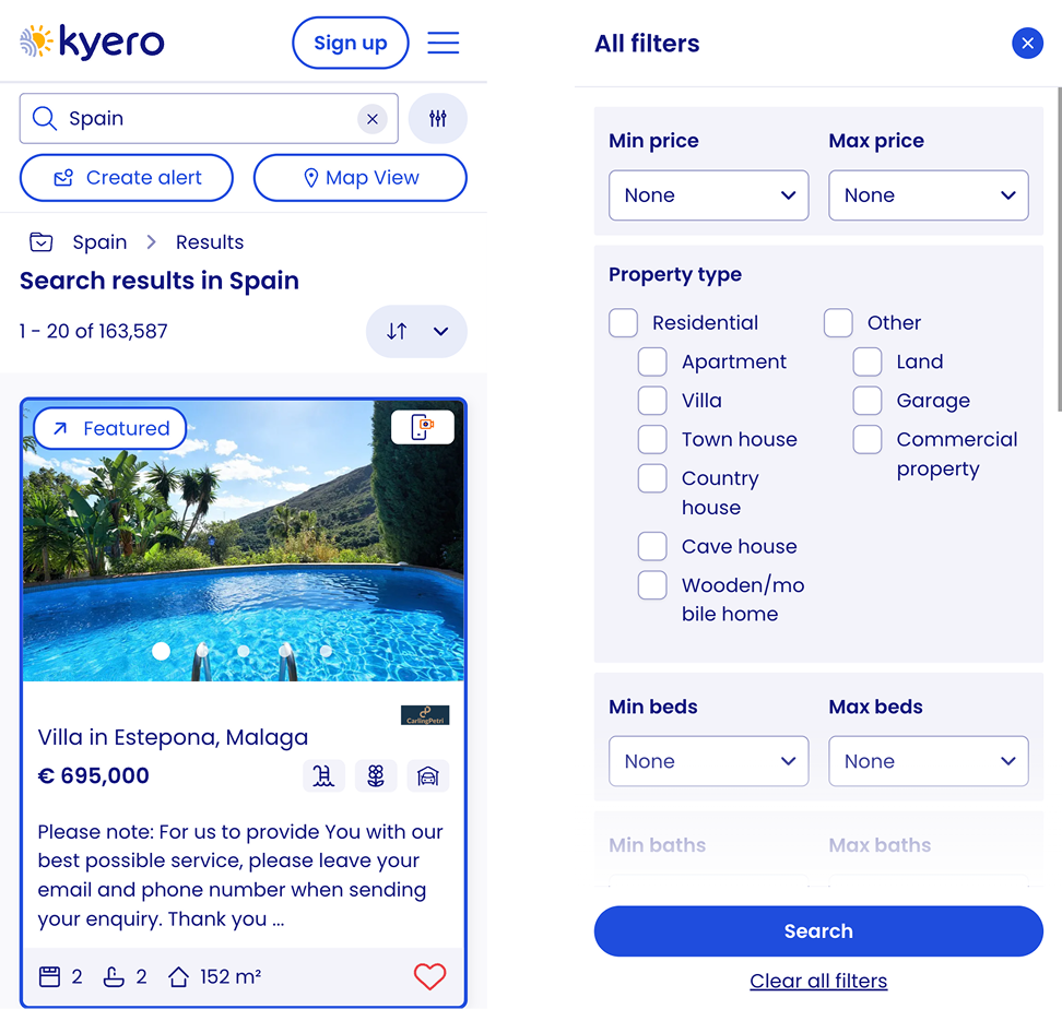
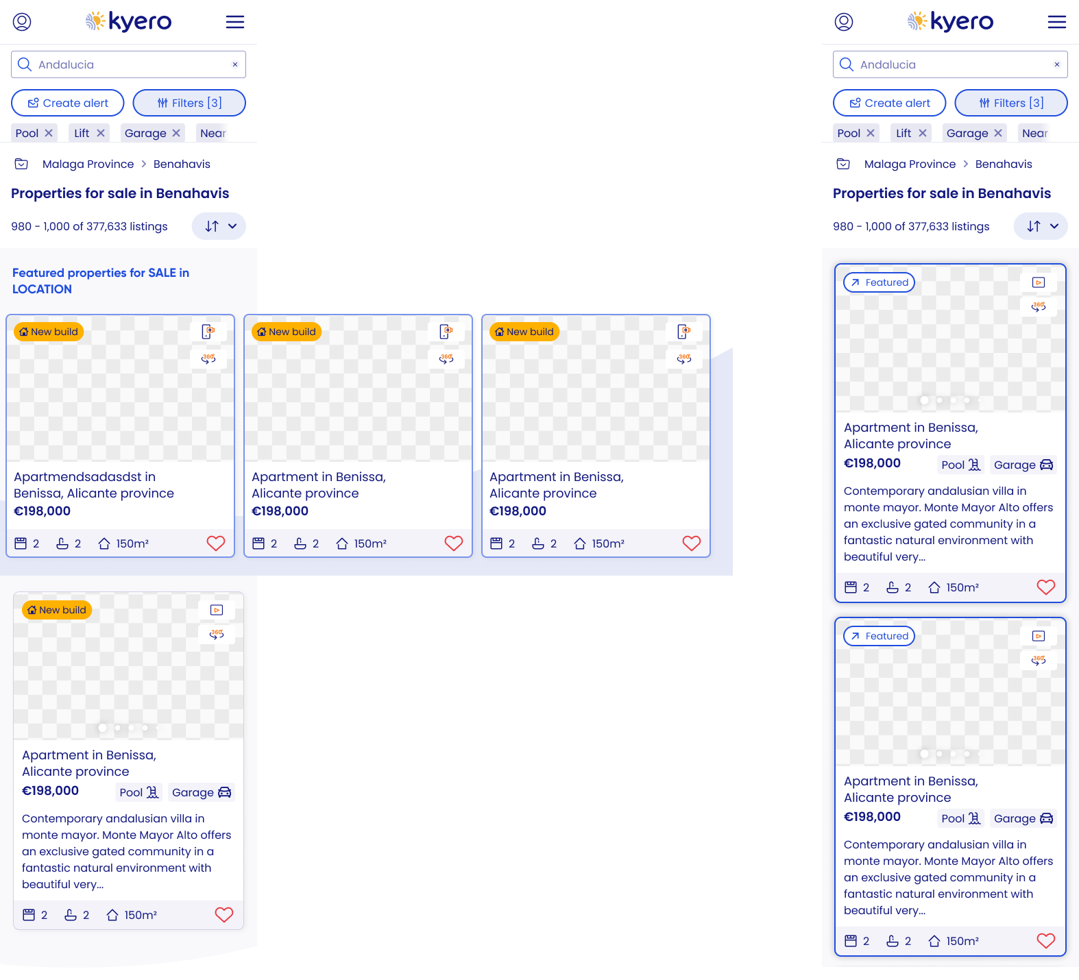
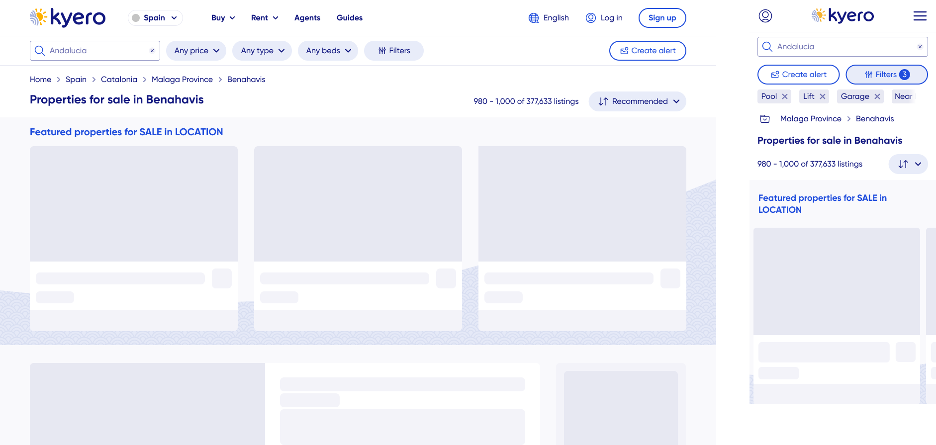
Search filters in a small drop-down
Previously, the filter area was all in a drop-down and required scrolling to see the full filter list. Routine user testing showed many users were not seeing the extended filter list because they were not scrolling inside the small filter modal dropdown, limiting both users’ ability to find relevant properties efficiently and Kyero’s perceived usefulness.Property tiles
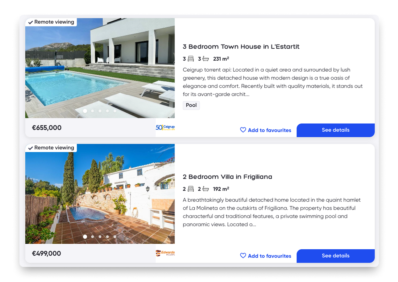
I theorised that the Kyero property tiles required a redesign to better support browsing and quick property comparison: most other search sites had larger images with more key info about the property pulled out.SEO
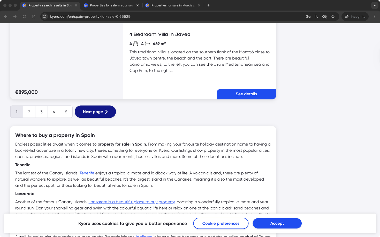
The search index was struggling to get clicks from search engines following a Google update. To remedy this, the index required an updated internal inking system, showcasing to users and search engines the value in additional areas and how many properties Kyero has listed.Design system
A new design system had been partially created for the previous pages’ UI updates. However, core components required for a modern search experience did not yet exist. Kyero needed new search components with interaction states and animations that aligned with the refreshed brand identity while remaining consistent with the existing system patterns and being scalable for future use.Stakeholders
The project balanced user needs, SEO performance and technical constraints on a critical page in the user flow, so it required close collaboration with engineering and SEO stakeholders. As one of Kyero’s highest-impact pages, the redesign required alignment and buy-in across multiple teams.
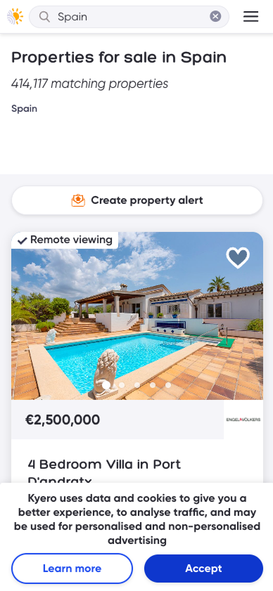
Outdated UI, unclear infromation in property tiles
Search filters crowded and hidden in a drop down
Problem statements
User problem statement
People searching for property on Kyero struggled to efficiently narrow down results and assess listings at a glance. Key search filters were hidden and easily missed, making it harder for users to refine results, while property cards lacked a clear visual hierarchy and showed little information to support confident comparison and decision-making during search.
Business problem statement
Kyero’s search index page was underperforming against user expectations and competitor experiences, limiting engagement with core search features and reducing the perceived value of the platform. SEO challenges negatively impacted click-throughs and the discoverability of Kyero’s property inventory.
Research challenge
How might we redesign Kyero’s property search index to make filters more discoverable, property listings easier to scan and compare and other location links more valuable to users and search engines, all while ensuring the design scales and complements an existing design system?
Impact
Filter usage increased, indicating improved discoverability and engagement with Kyero’s advanced search capabilities.
Search area exploration improved, as users explored additional locations and property types through the links in the new right-hand nav
Create alert CTA was prioritised in the UI to promote email alert creation, one of Kyero’s highest converting user contact points - resulting in more property enquiries.
Kyero’s search look-and-feel was improved and brought in line with the rest of the site. The design system was extended with scalable, reusable search components.
Approach and rationale
Research
All user research was conducted remotely. Existing users were recruited through Kyero’s annual buyer survey and interviewed on Zoom, and new/naive users were sourced and interviewed through usertesting.com test platform.
-
It started with routine usability testing, observing new and existing users using the site without prompting. Many did not discover the filters in the original design. Throughout the design process, I tested features, especially the search filters, to ensure they were intuative, especially for older users and across device types.
-
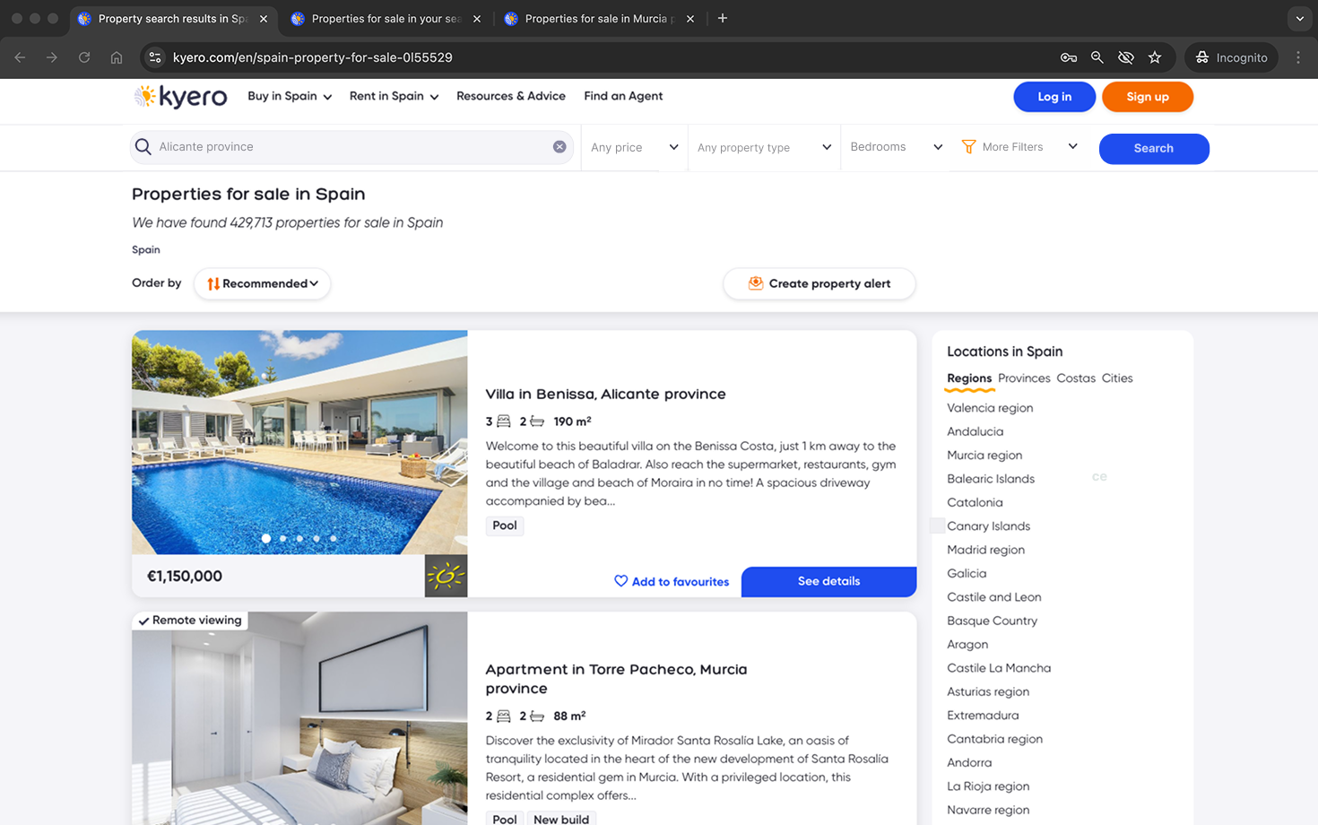
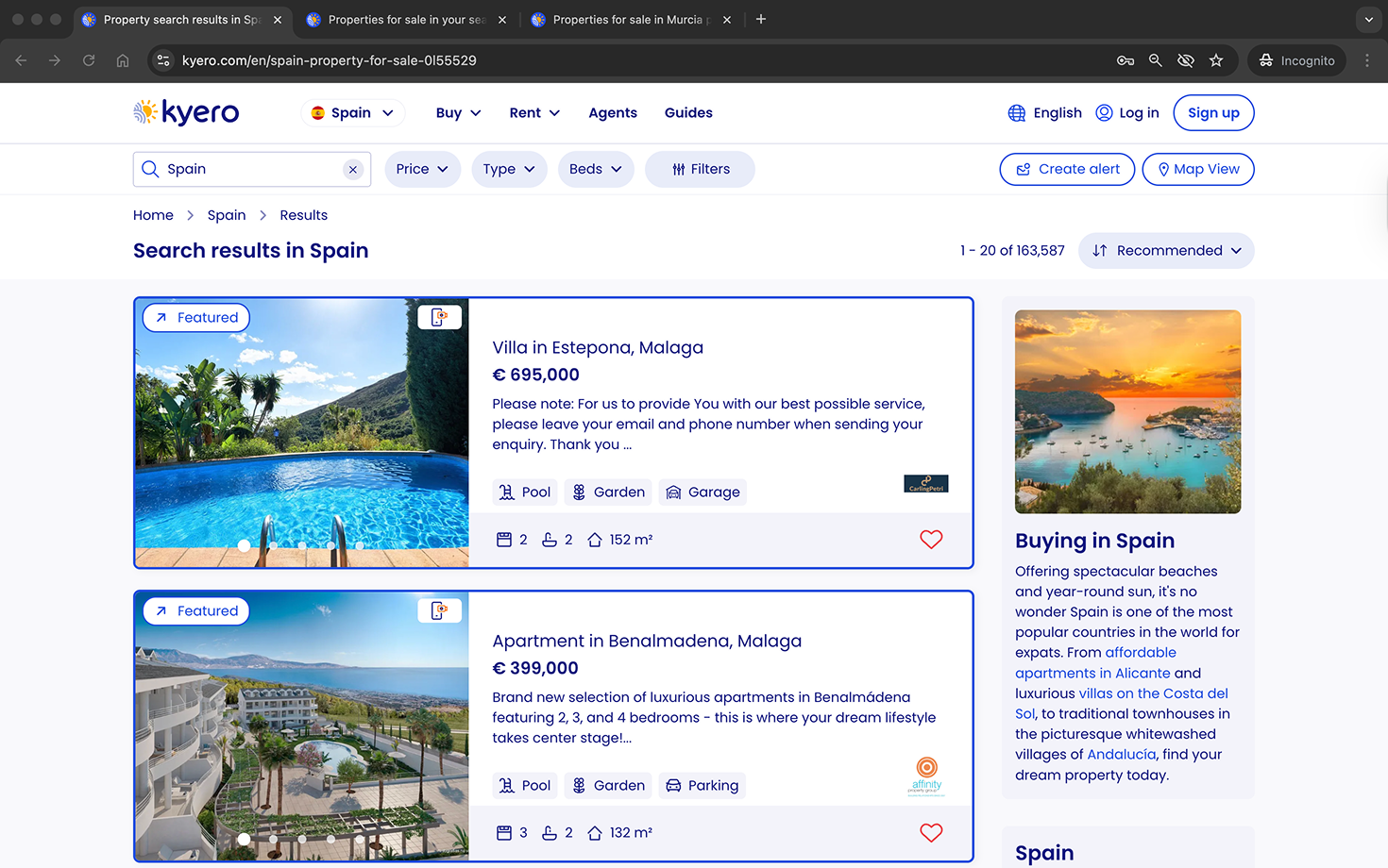
To explore the context in which Kyero sits from a user perspective, I researched other property portals (both domestic and international) to support understanding of users’ expectations around search functionality and UI. This helped define the minimum viable experience.
-
I used lo-fi and mid-fi wireframes to quickly test layout, interaction patterns and expected site behaviours without over-investing time into multiple pixel-perfect designs.
This was particularly useful to iterate the property cards to ensure the most useful and impactful info was being prioritised.
-
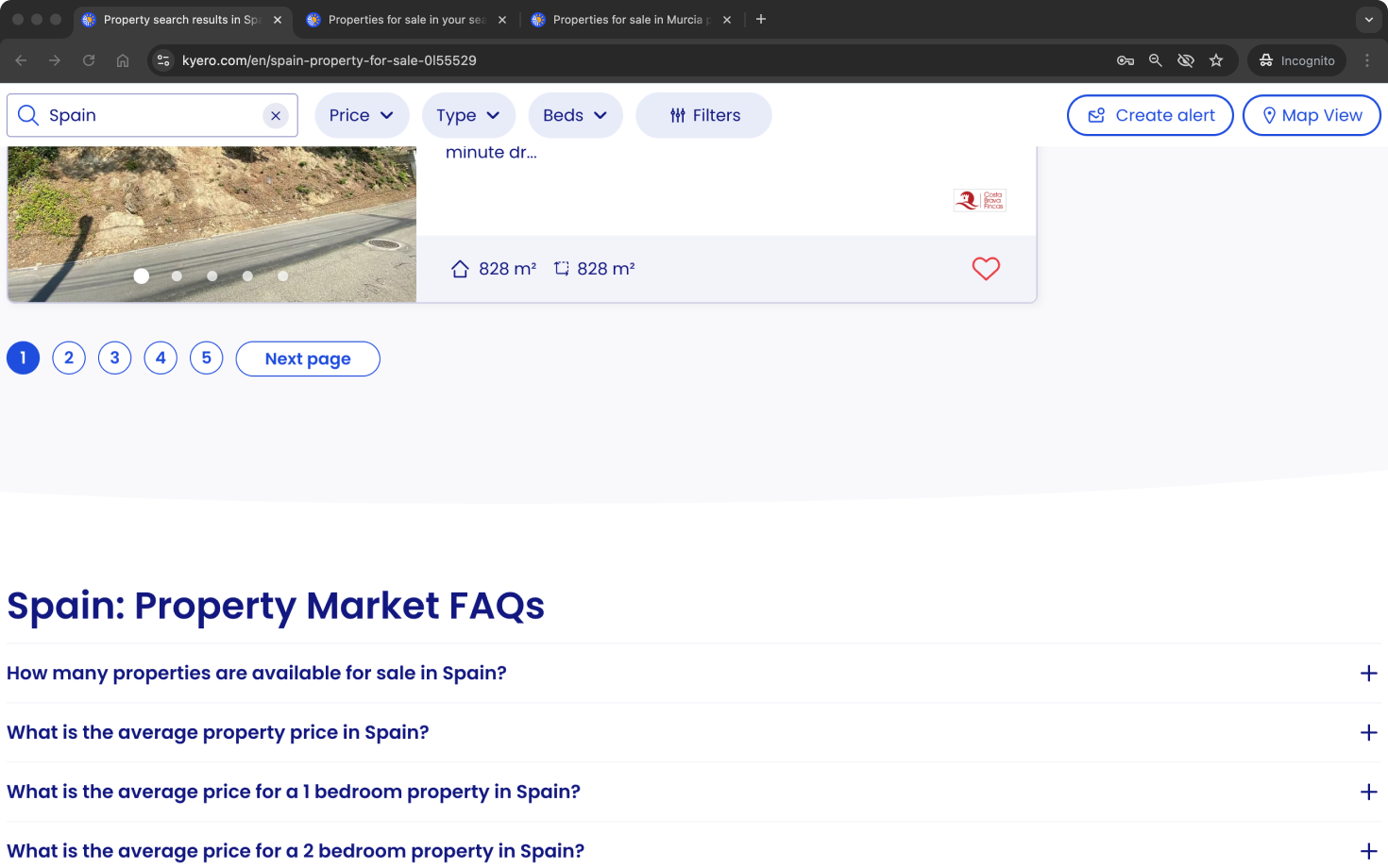
Throughout the design and post-launch stages, I tested and refined the experience with high-fidelity functional prototypes to identify mismatches in user expectations and the final design. Examples include the right-hand nav, which was not perceived as useful initially, and copy changes from EG “Popular searches” (which users did not value) to “Explore area” which was better valued.
Desk research into competition, both direct and domestic

Search bar development for user testing
User testing spotlight: Search bar iteration
The original search design showed search “To Buy” and “To Rent” in the same area, giving equal visual parity and users the option to quickly switch between buy and rent search results (which appear on separate search indexes). For the redesign, I explored ways of combining the search bar with these options to create space in the design and reduce visual clutter.
Through four series of live user testing, the outcome was unexpected: Users did not have any value for the ability to quickly switch between buy and rent; the majority described the feature as 1 or 2 out of 5 for how useful it was to their search. Users did not miss it in pre-launch testing or after launch.
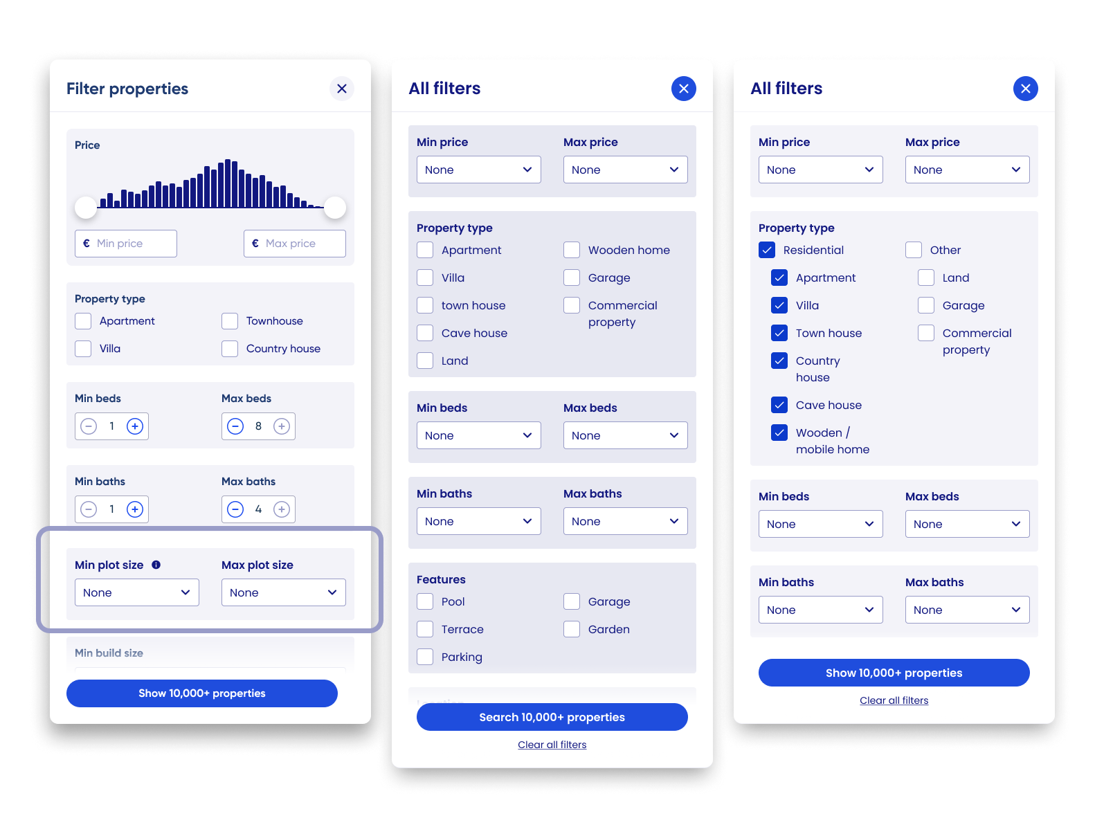
Filter pop-in development, showing early iteration with plot size.
What we couldn’t do
Add search filters requested by users but not supported by the inventory detail. EG Plot size, turn-key ready. These were delayed until we can inform agents on the benefits of adding them, to launch the filters when the inventory reflects a credible offering of these details applied to properties.
Design exploration
Low-fidelity concepts
Created lo-fi wireframes to develop concepts and explore layout, including:
Configuration of the mobile filter bar behaviour, balancing space with dense actions
Layout of above-fold area, including reviewing the featured properties
Lo-fi to launch iteration
Incorporated stakeholder input and early usability testing to refine concepts before prototyping. Iteration continued post-launch, using live user data and feedback EG Adding in category selectors in the property type filter modal, and a “Clear filter” action in the quick access filter drop-downs for price, type and beds.
Design and iteration examples

Outcomes
By adding map-based exploration to search, users felt more confident expanding beyond fixed locations, leading to broader area discovery and improved engagement.
Introducing live property counts and clearer navigation cues reduced confusion, particularly for older users, enabling intuitive adoption without onboarding or increased friction.
Post-launch analysis showed map users viewed +16% more properties per session, validating that the map search improved user confidence to meet business goals.
Live design
Further detail:
-
Users unfamiliar with local areas often hesitated to expand search boundaries to include neighbouring towns when listed as a suggested area in the search index view. Providing a map view increased ease of area exploration and encouraged buyers to search for properties beyond their search locations.
Result
This insight justified the addition of map view to property search, as it expanded search location engagement and property discovery.
-
Users were confused when areas appeared empty under the original “search this area” model. Real-time property counts and load states which are responsive to search filters and map movements made interactions predictable, location labels informative (with property counts) and ultimately reduced frustration.
Result
Implementing live updates directly improved usability, whilst maintaining fast load times, and increased dwell time on the site and the number of locations searched.
-
Wide-screen map interface caused confusion for some older users (Kyero’s main demographic). A fixed, clear “list view” button and informative icons resolved navigation issues, maintaining UI expectations established by industry competition while adding new value to the Kyero search.
Result
The approach minimised learning friction, supporting adoption without alienating existing users and also ensured older, less tech-savvy users were able to return to the map - reducing search abandonment and site exit risk.
Final design
Reflections and skills
Question inherited designs
This project reinforced the importance of questioning inherited design patterns rather than treating them as fixed requirements. For example was the Buy / Rent toggle within the search bar; a long-standing feature that seemed essential, but through repeated user testing was shown to add little value to users’ search journeys.
By inspecting each element of the interface through the lens of real user needs, I was able to remove functionality that introduced complexity without benefit. This emphasised the value of continuously questioning and validating design assumptions to ensure every UI element is justified.
Discoverability > adding more features
Improving discoverability of existing functionality (EG search filters hidden in a scrolling modal) delivered more impact than introducing new features, reinforcing that clarity is crucial for information-heavy search experiences.
SEO and UX are not opposing forces
This project demonstrated that SEO-driven requirements, when designed thoughtfully, can enhance user navigation rather than detract from it. Users liked the suggested links in the right-hand column, and thoughtful copy revisions maximised their attractiveness for users (EG chaning “Popular searches” to “Explore area”.
Skills
Design systems development
Adding reusable components aligned to the brand UI and complementing the existing design system for future growthUser-centred research and validation
Leading usability testing and translating insights into design decisionsUX strategy and problem framing
Defining problems at the intersection of user needs, business goals and technical/SEO constraintsSearch and discovery UX
Designing complex filters and navigation experiences for a critical page of the user journeyIterative, evidence-led design
Prototyping, testing and removing low-value features to simplify the UI for ease of use
Explore other projects