
Good Spaces
UX/UI design | Stakeholder management | Brand design | User research | Client project
Full website design and re-brand for a film and TV location agency - design sprint.
Deliverables
- Visual brand identity
- Hi-fidelity prototype
- Tablet & mobile responsive design
Date
- Dec 2022
Scope
- 9 days, a team of 4


Design thinking process
Empathise
Stakeholder interview
User interviews
Define
User persona
User journey
Problem statement
Ideate
MoSCoW Matrix
Happy path
Initial sketches
Prototype
Lo-fi & mid-fi prototypes
Brand design
Hi-fi & responsive prototypes
Test
User testing
Design iterations
A/B & Desirability testing
Client
A film and TV location agency based in Bristol that supports film and TV crews, matching them with the perfect locations for their productions.
Brief
Identified through a brief client call, Good Spaces needed a refreshed website and brand identity to communicate its location expertise and business values of professionalism, communication and trust. This project was for an Ironhack brief to redesign a responsive business website for an existing business.
Step one of the design sprint

Stakeholder interview
Key themes
The key themes were business pressure from growing competition and clients going cold. The website is a facet of their business that they’ve been meaning to update.
They shared the aspects of their business that they pride themselves on and wish to highlight through business branding and their website design, these include;
Great client relationships
Experts at matching scripts and locations
Always available on the phone, highly responsive

User interviews
Taking the stakeholder interview findings informed our user interviews. We were focused on learning about the context of their role, and their needs and trying to understand their emotional position when making bookings.
Interviewees’ experiences ranged from ten years working in events and launches to former producers working in film and TV and business owners looking for locations for on-brand photo shoots.
Following a user test of the existing site users commented on the;
Old, tired branding
Hard to use/navigate/complete search function
Unclear property details
Unclear next step for contact when a desirable property had been found.
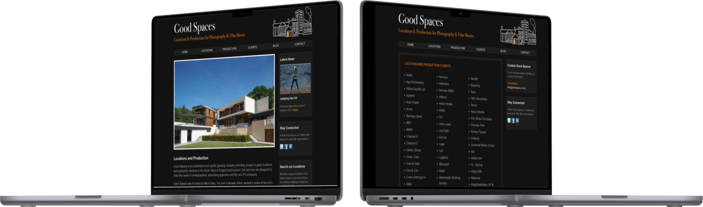
We also performed a brief user test on the existing site, above.
Interviews → Quotes
→ Affinity diagram → Insights

User interviews
Key findings;
Location scouts work under a lot of time pressure.
They usually know exactly what property they are looking for and need to be able to find it as fast as possible (as opposed to browsing through many options).
They see a lot of location scout websites per search, making snap decisions about which to use based on their UI.
Pains include not knowing who to contact when they find a property and not being able to trust that they will get back to enquiries in time if making contact by email.
Their goal is to secure a location as fast as possible, time pressure is a huge factor.
One of the key things we learned about the user:
They already know exactly what location they’re looking for and they want to find it as fast as possible.

On worst-case scenarios
The worst experience was not being able to find a place on time...you don’t know if it’s available, you don’t know its features... You have no information.

On the industry
Most things were last minute so I would spend time only on websites that were really clear [with] good communication [...] definitely judging a book by its cover.
On the existing website
These filters without anything need to go! The search section doesn’t even work.
User persona
Next, interview insights were interpreted, via an empathy map, to create our user persona - (time) Pressured Penelope.
In summary, Penelope is a junior producer, under pressure from her senior producers and directors to find the perfect location for a shoot starting soon. She is pained by not knowing if location agencies will get back to her in time and frustrated if they don’t as it eats up her limited time.
Click to expand
User journey
From this, we developed Penelope’s journey.
The main area of frustration in the current path is having to find the perfect-looking location but not being shown the extra information needed to make a decision then also not being clear on when to expect a reply. This leaves her worrying that she may be wasting her time and should move on to a different agency.
Her high point is a feeling of relief and success when the scout gets back to her asap, helpfully talks her through the details and the location is booked.
Click to expand
Key area of opportunity
The main opportunity lies in improving the website’s location search functionality and information on the individual location pages.
Problem statement
With an in-depth understanding of our users and a clear area of opportunity to be explored in their user journey, we defined the problem statement.
The time-pressured junior producer needs to find a way to effectively navigate through vast databases of locations on one website because searching multiple, inefficient online systems is slow and confusing.
How might we…
The following how might we statements further defined the problem and supported us in building the MoSCoW Matrix and happy path.
How might we;
…categorise locations into groups with criteria that align with the users’ search criteria to help them search efficiently.
...create the most time-efficient location search system for time-pressured users who have a clear idea of what they want.
...design a website that is clear and easy to navigate through so users can follow the user journey to quickly complete their desired task.
MoSCoW matrix
We created the MoSCoW matrix to define what we must include in the website and things that we definitely can’t.
Search and location image optimisation were the priority. We decided not to include pricing and availability on the website because our client preferred people to get in touch directly so they can recommend the best options (even though this was contrary to preferences expressed in user interviews).
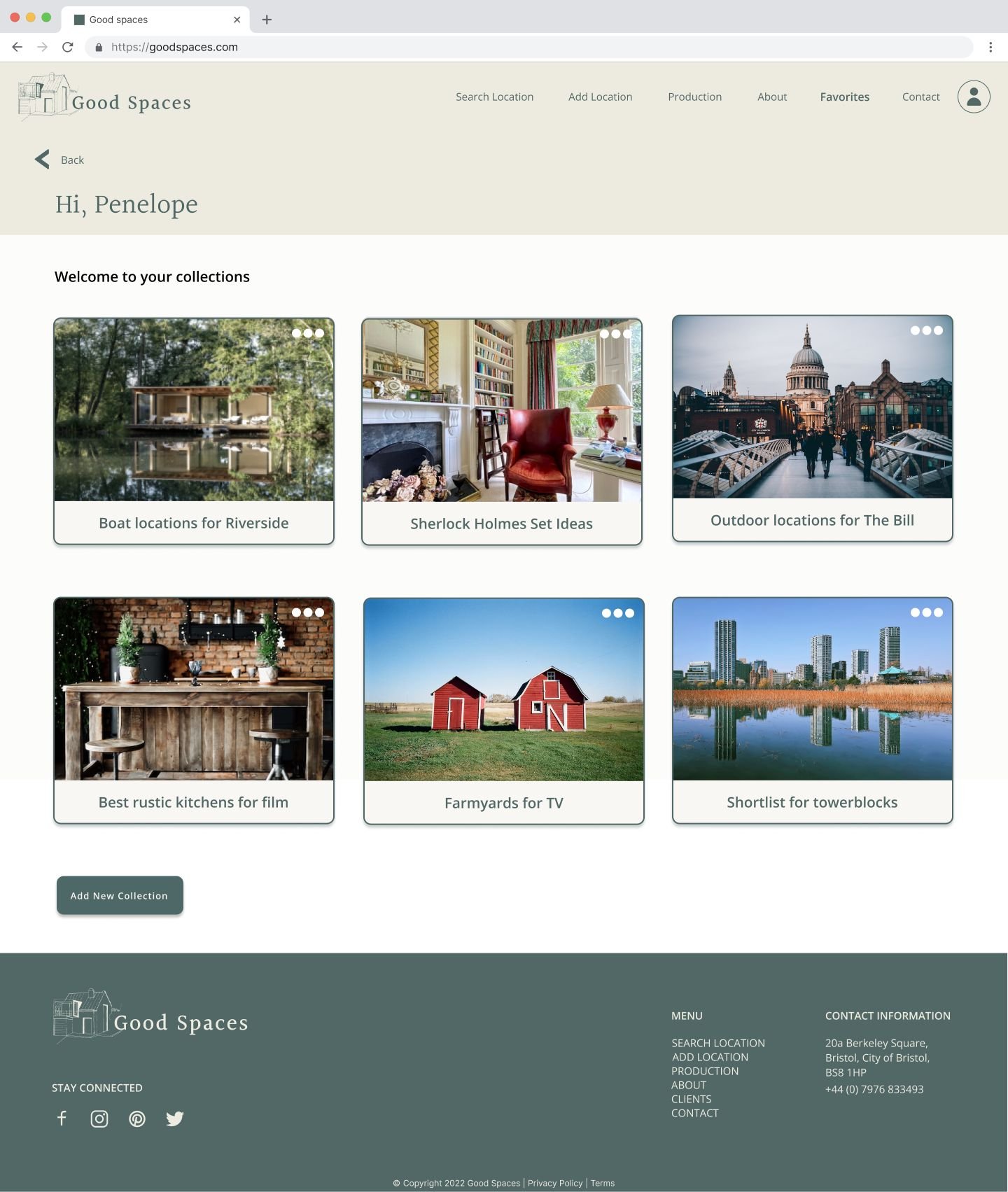
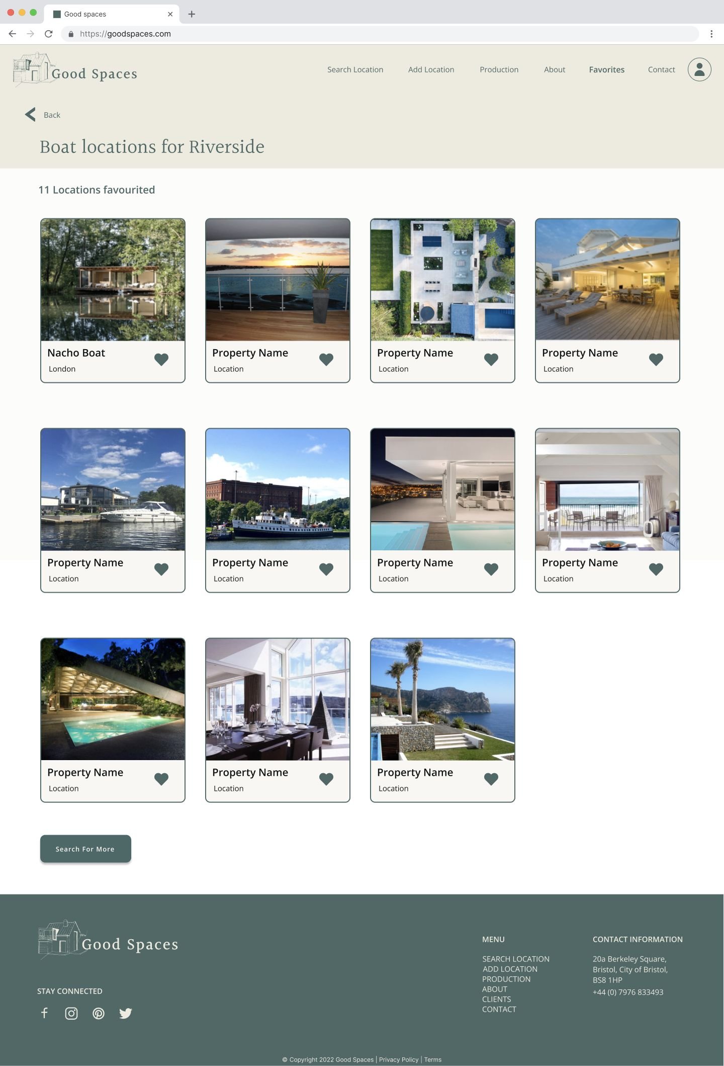
We included an option for users to favourite locations whilst searching to create favourited collections to support their search and easily share shortlists with colleagues or Good Spaces.
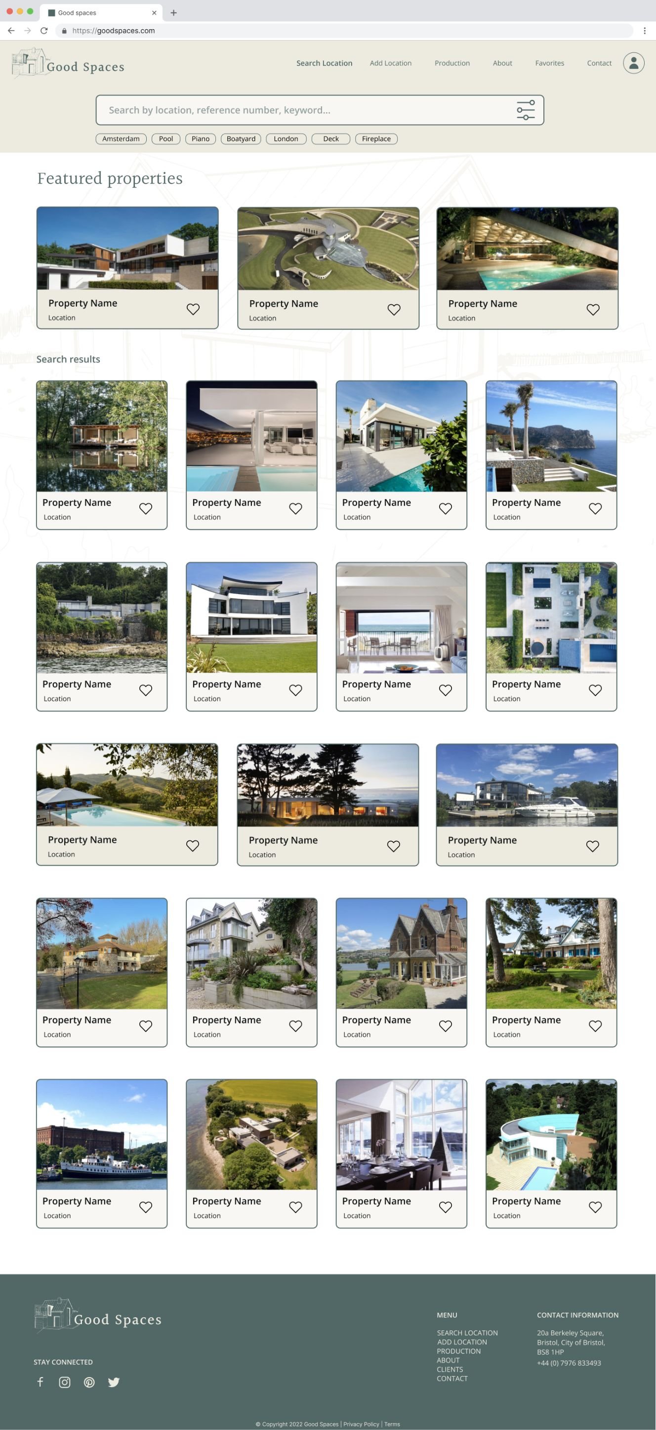
The goal of the website, at the bare minimum, is to provide users with a categorised database of location profiles with a filter/search functionality.
Users can search for locations based on their predefined needs by refining their search options (location, category, feature, etc.) so they can access more specific search results.
By having this feature, users will be able to browse location profiles with high-quality images and key information more quickly, making it easier for them to find the location they seek and contact the company.
Minimum viable product statement
User flow / happy path
Taking our key features, I sketched and then formalised two different user flows, one for searching and saving properties to a favourites feature and one to log in / view the favourites collections.
Click to expand
Ideation & Prototyping
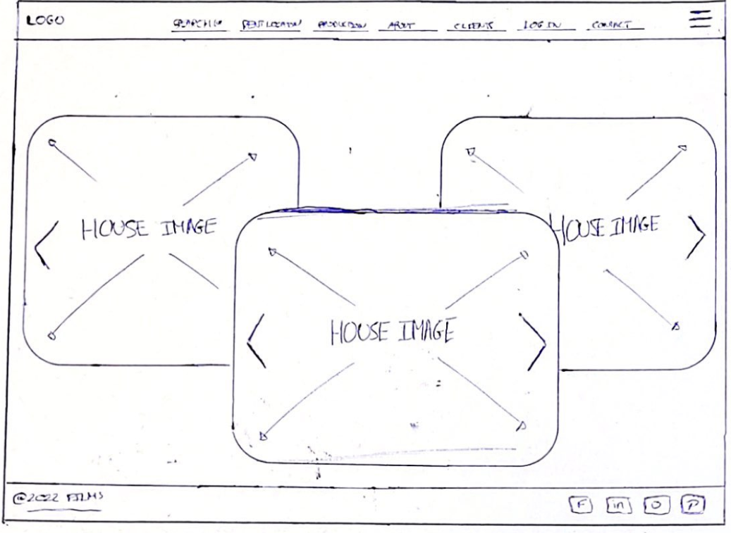
Ideation sketches
Lo-fidelity
Mid-fidelity
Initial ideation formed the basis for lo-fi sketches which were refined through user testing to generate mid-fidelity prototypes that were also tested and updated for the most user-friendly design.
Concept sketching
Concept sketching
Selected lo-fidelity prototype pages ↓


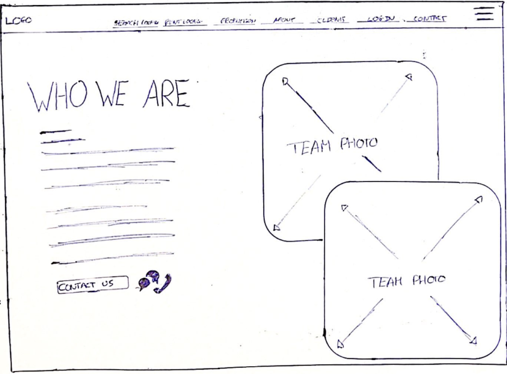
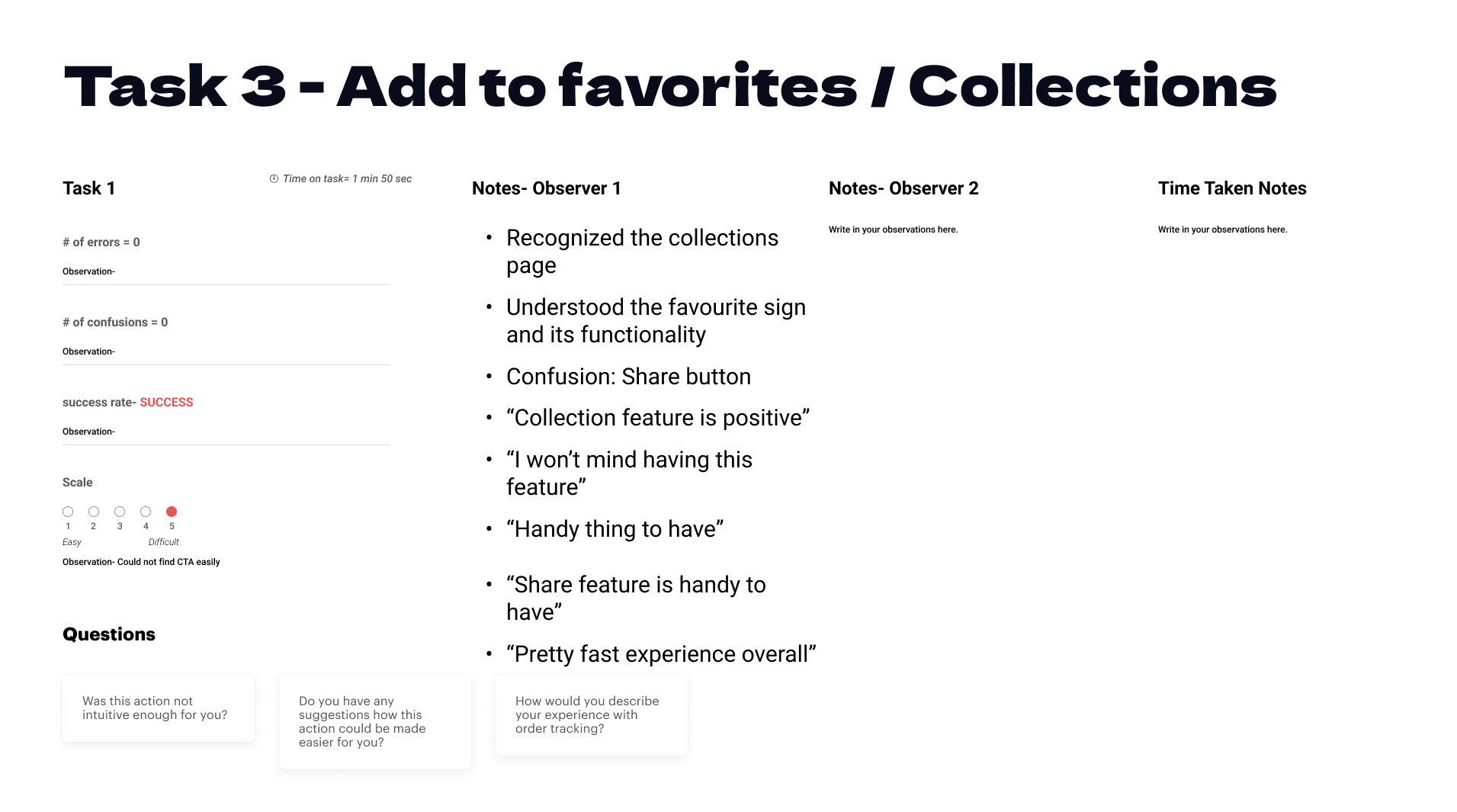
Lo-fi testing
User testing of our lo-fi prototype was undertaken with five users, and the majority of feedback was positive. The main action we took following the feedback was to update the navigation by removing the hamburger menu on the desktop as users found it confusing.
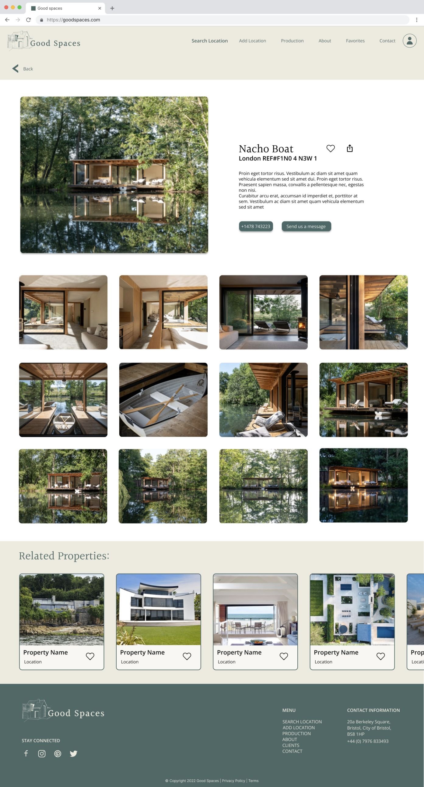
The lo-fi design was image-heavy, based on user feedback that lots of good-quality images of locations were invaluable in their aesthetic-based decision-making processes.
Users were also positive about the collections features allowing users can ‘heart’ properties they like, saving them into collections for future reference and to help in the shortlisting process.
Selected mid-fidelity prototype pages ↓
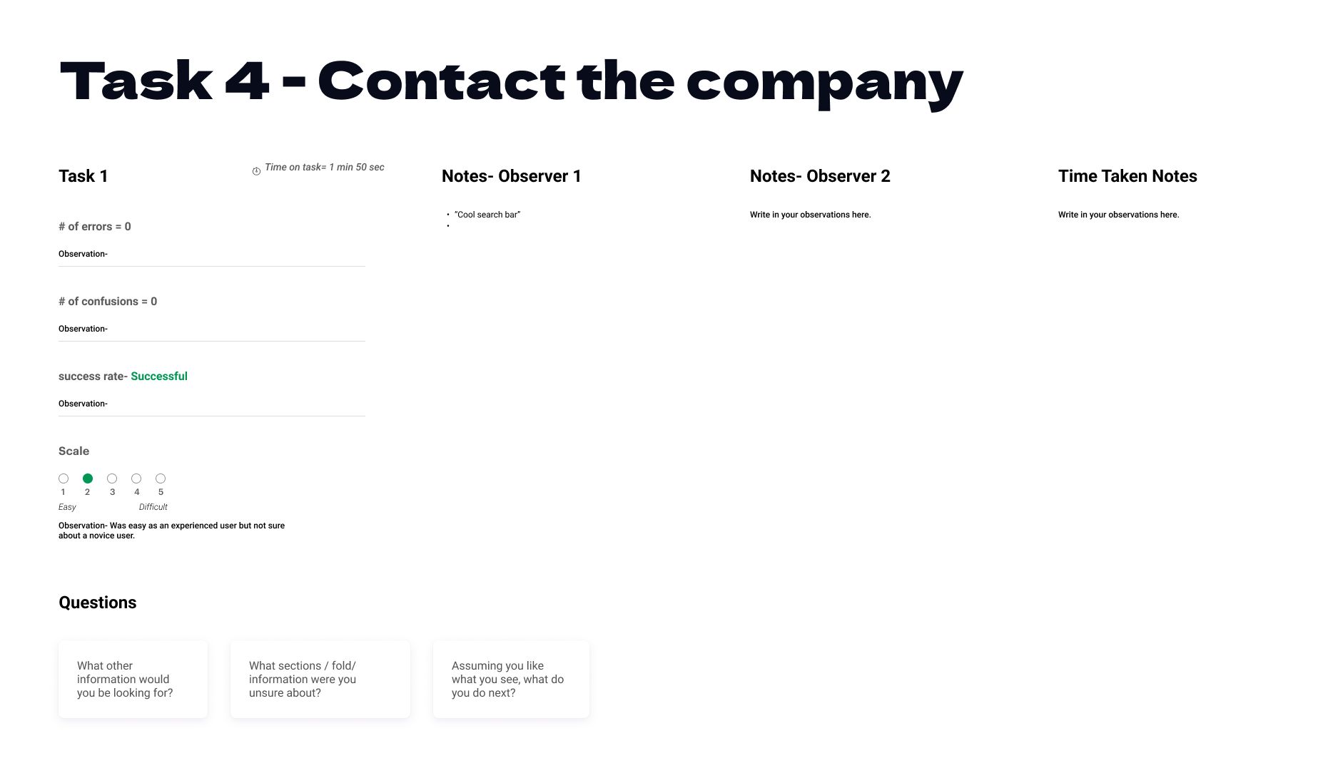
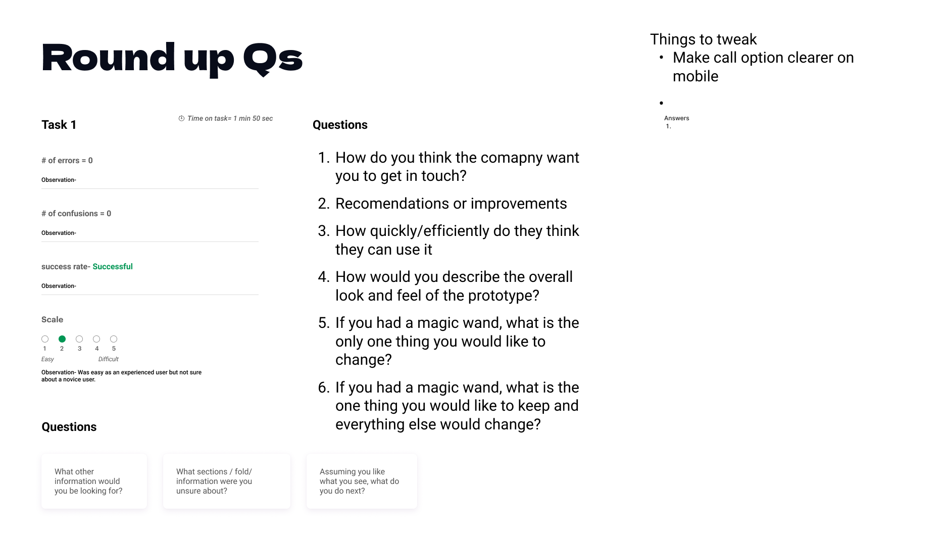


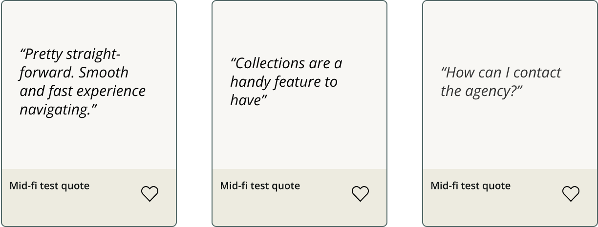
Mid-fi testing
Next, we developed our mid-fi prototype with the updated aspects from lo-fi testing and tested it again.
The main feedback was mainly positive however feedback on frustrations in the design prompted us to;
Make the favourites area easier to navigate by simplifying the options available including adding a direct link to ‘Favourites’
Increase the amount of white space on the home screen, leaving the above-fold search feature the star of the show on the home page
Pull out clearer ‘Contact us’ call to action points on the location pages.

UI / Branding
From this we worked on our brand look and feel, the starting point - brand keywords;
Approachable → Users need to feel they can pick up the phone
Reliable → A key user pain point was having agencies not replying to them or flaking at the last minute
Bespoke /tailor-made → The agency pride itself on being able to suggest suitable locations after hearing the user briefs
Intuitive → The stakeholder shared that it takes a certain amount of intuition and deep understanding to support their users in matching briefs with locations.
Down-to-earth → A key quality communicated by the stakeholder and appreciated by users.
We collated key visuals into a mood board which we tested with 30 users, asking them to list five key adjectives the board represented to them. This validated the key feelings we wanted to convey with the visual elements of the design (see chart).
Based on these visuals and the feelings we want to convey, we curated colours and fonts to develop a style tile.
Brand keywords: Clean, Reliable, Intuitive, Bespoke, Approachable
Moodboard
Moodboard testing
Pressured Penelope works her way through Google’s search results, judging websites in moments. We wanted the UI of the site to instantly communicate calm and a feeling of reliability that tells Penelope she has arrived at the solution she is looking for - a clear, responsive and helpful business with a great property search feature.
Colours are a neutral, soothing palette with a rich cream as the primary colour, dark sage green as the secondary and a limited collection of neutrals.
The font is Halant, a solid serif — professional but not overly crisp and intimidating. This font is paired with Open Sans, a very easy-to-read sans serif with complementary letter styles.
Mid-fidelity prototype + brand identity →
First hi-fidelity design which we tested and updated before delivering the final hi-fidelity prototype.
Style Tile

Hi-fi testing
Modern, stylish, clean, inviting
During hi-fi testing we found users were not interacting with some parts of the site, so we added hover animations to promote clicks. Overall, users were delighted by the hi-fi, they summarized the design of the site with reaction cards and the most popular adjectives were modern and stylish.

As a team, we discussed the layout for the presentation of the different search refine filters. After building two different options we also shared these with our three hi-fi test users.
Between a dropdown and a slide-in overlay, the overlay was preferred for being simpler and not requiring a scroll-down below the fold to interact with.
A/B testing - Search options

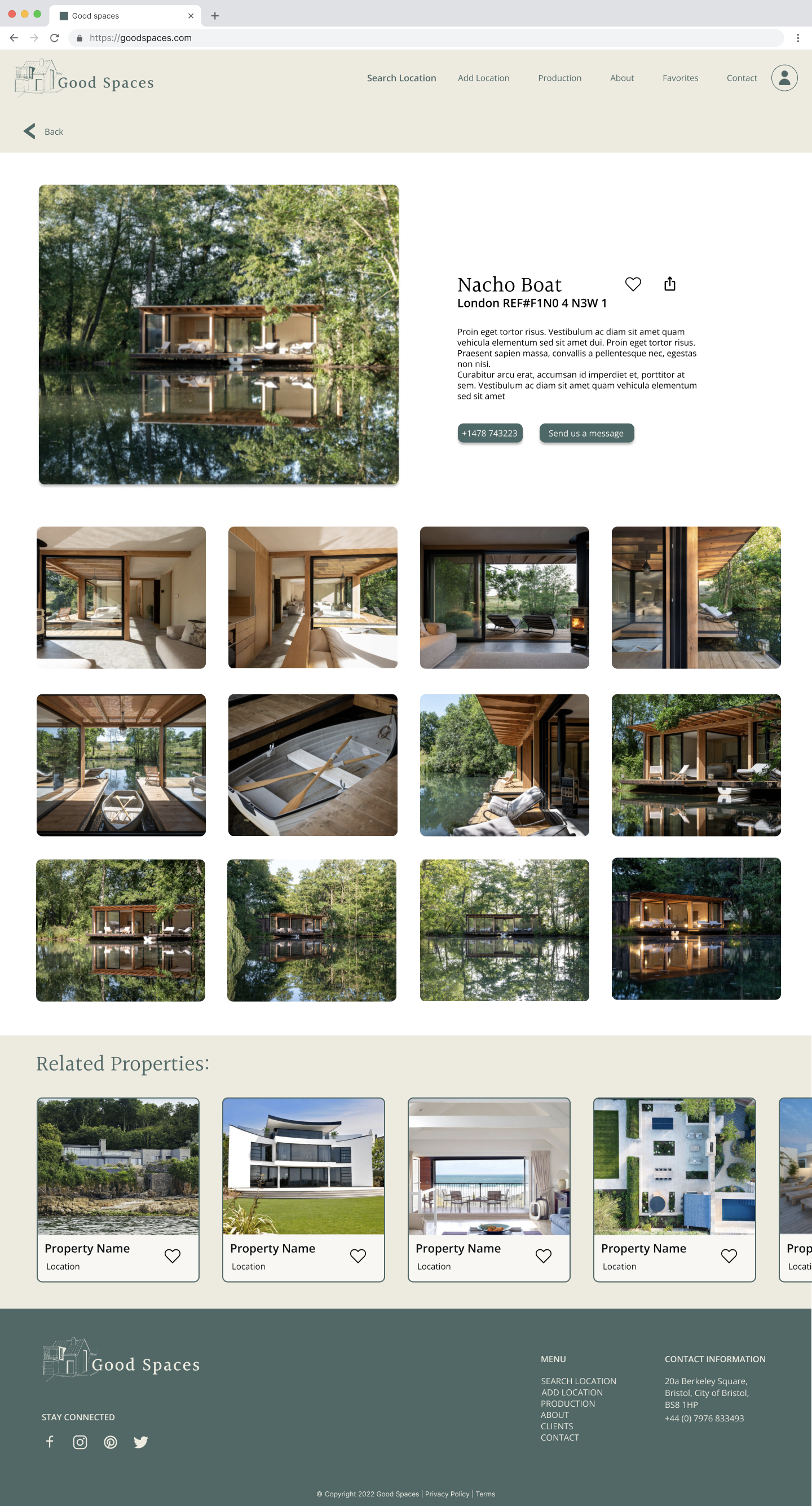
Final hi-fidelity prototype
Unmute for a guided walkthrough and design insights.
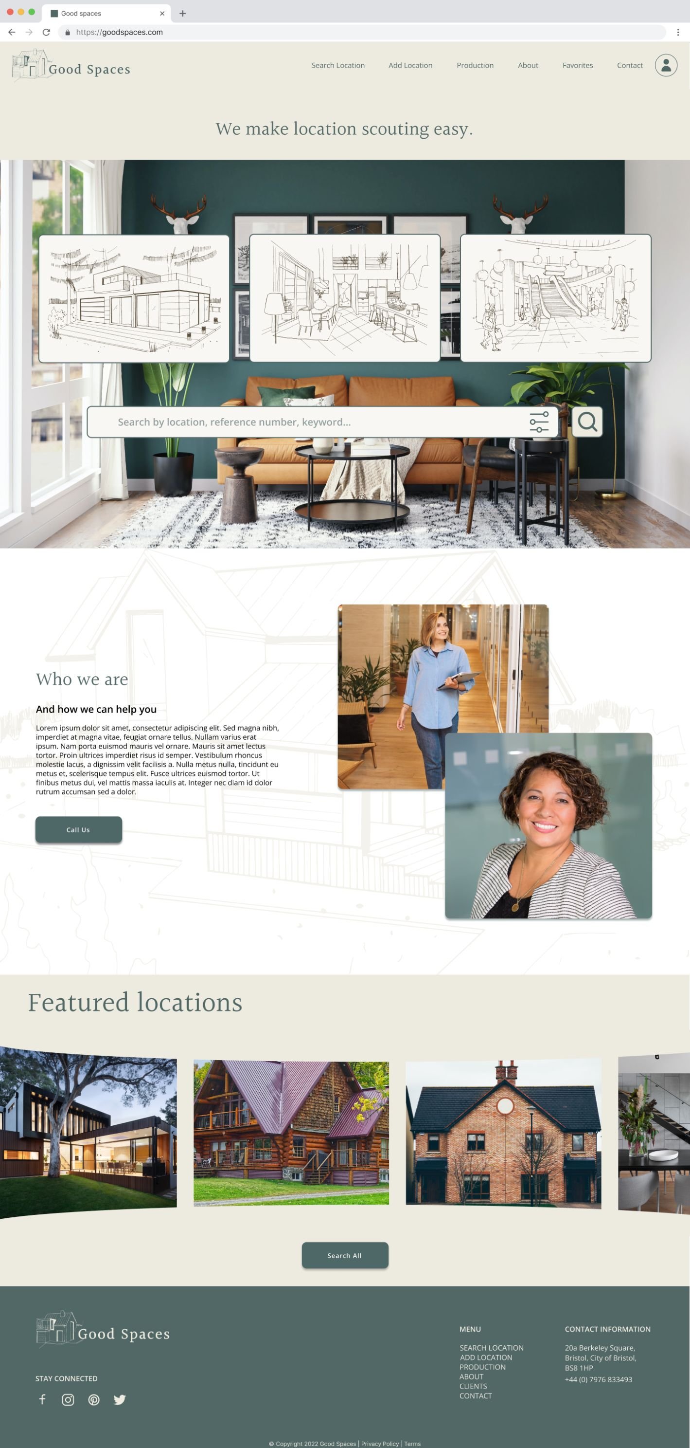


Responsive design

Next steps & Learnings
For this project, the stakeholder (business owner) was only involved during the stakeholder interview. Given more time we would have loved to share our work and actioned client feedback — especially around the search functionality and the likelihood from their end of keeping it up to date and populated with the appropriate search words. We would also have liked to build out more specific location search properties and continue refining the search functionality with users.
The main learnings for me were the power of UI to promote user engagement, the importance of small interactions (eg hover animations) to support an intuitive user experience and how much a hard-working team can accomplish in a short time!

Finally
I would like to thank Good Spaces for their initial input and my teammates Adriene, Charles & Danish who were my colleagues on this project.
If you are interested in collaborating on a project or expanding your full-time UX team, get in touch.